5.5. Advanced topics
5.5.9. An EDA approach to experimental design
5.5.9.10. |
DOE contour plot |
-
Where else could we have run the experiment
to optimize the response?
- Data: which of the n design points yielded the best response, and what were the settings of that design point, or from
- Averages: what setting of each factor yielded the best response "on the average".
-
"From among the n data points, what was the best setting?"
-
"In general, what should the settings have been
to optimize the response?"
- Primary: Best setting (X10,
X20, ..., Xk0) for each
of the k factors. This derived setting should yield
an optimal response.
- Secondary: Insight into the nature of the response surface and the importance/unimportance of interactions.
- Vertical Axis: The second most important factor in the experiment.
- Horizontal Axis: The most important factor in the experiment.
- Axes
- Contour Curves
- Optimal Response Value
- Best Corner
- Steepest Ascent/Descent
- Optimal Curve
- Optimal Setting
- Axes: Choose the two most important factors in the
experiment as the two axes on the plot.
- Contour Curves: Based on the fitted
model and the best data settings for all of the remaining
factors, draw contour curves involving the two dominant
factors. This yields a graphical representation of the
response surface. The details for constructing linear
contour curves are given in
a later section.
- Optimal Value: Identify the theoretical value of the response
that constitutes "best." In particular, what value would we
like to have seen for the response?
- Best "Corner": The contour plot will have four "corners" for the
two most important factors Xi and
Xj: (Xi, Xj)
= (-, -), (-, +), (+, -), and (+, +). From the data, identify which
of these four corners yields the highest average response
\( \bar{Y} \).
- Steepest Ascent/Descent: From this optimum corner point, and
based on the nature of the contour lines near that corner,
step out in the direction of steepest ascent (if maximizing) or
steepest descent (if minimizing).
- Optimal Curve: Identify the curve on the contour plot that
corresponds to the ideal optimal value.
- Optimal Setting: Determine where the steepest ascent/descent line intersects the optimum contour curve. This point represents our "best guess" as to where we could have run our experiment so as to obtain the desired optimal response.
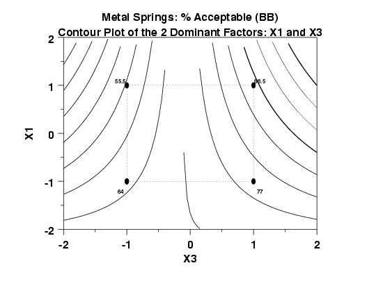
The tool of choice to address this goal is the DOE contour plot. For a pair of factors Xi and Xj, the DOE contour plot is a 2-dimensional representation of the 3-dimensional Y = f(Xi, Xj) response surface. The position and spacing of the isocurves on the DOE contour plot are an easily interpreted reflection of the nature of the surface.
In terms of the construction of the DOE contour plot, there are three aspects of note:
- Pairs of Factors: A DOE contour plot necessarily has two axes
(only); hence only two out of the k factors can be
represented on this plot. All other factors must be set at a
fixed value (their optimum settings as determined by
the ordered data plot,
the DOE mean plot, and
the interaction effects matrix plot).
- Most Important Factor Pair: Many DOE contour plots are possible.
For an experiment with k factors, there are
\( \left( \begin{array}{c}
k \\ 2
\end{array} \right)
\frac{k!} {2!(k-2)!} = \frac{k(k-1)}{2}
\)
possible contour plots. For example, for k = 4 factors
there are 6 possible contour plots:
X1 and X2,
X1 and X3,
X1 and X4,
X2 and X3,
X2 and X4, and
X3 and X4.
In practice, we usually generate only one contour plot
involving the two most important factors.
- Main Effects Only: The contour plot axes involve main effects only, not interactions. The rationale for this is that the "deliverable" for this step is k settings, a best setting for each of the k factors. These k factors are real and can be controlled, and so optimal settings can be used in production. Interactions are of a different nature as there is no "knob on the machine" by which an interaction may be set to -, or to +. Hence the candidates for the axes on contour plots are main effects only--no interactions.
- Optimal settings for the "next" run:
Coded : (X1, X2, X3) = (+1.5, +1.0, +1.3)
Uncoded: (OT, CC, QT) = (1637.5, 0.7, 127.5) - Nature of the response surface:
The X1*X3 interaction is important, hence the effect of factor X1 will change depending on the setting of factor X3.


