
|
SIEVE PLOTName:
We can define the following values for the contingency table:
When the two variables are independent, then the expected frequency is:
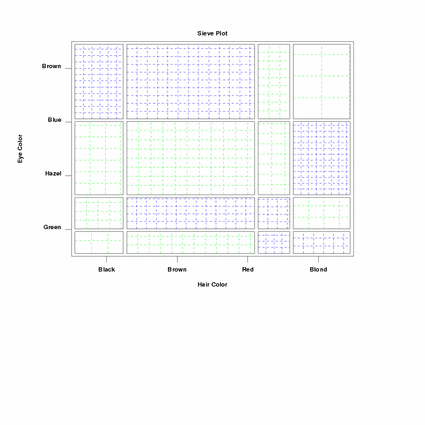
In a sieve plot, each mij is represented by a rectangle. The width of the rectangle is proportional to the total frequency in each column, n+j and the height is proportional to the total frequency in each row, ni+. The area of the rectangle is then proportional to mij. Each rectangle is then cross-ruled based on the observed frequency. The deviations from independence are reflected in the density of the shading. Denser shading indicates the observed frequency is greater than expected and sparse shading indicates the observed frequency is less than expected. As an additional cue, positive and negative departures from independence can be coded with different colors.
where <y1> is the first response variable; <y2> is the second response variable; and where the <SUBSET/EXCEPT/FOR qualification> is optional. This syntax is used for the case where you have raw data (i.e., the data has not yet been cross tabulated into a two-way table).
where <m> is a matrix containing the two-way table; and where the <SUBSET/EXCEPT/FOR qualification> is optional. This syntax is used for the case where we the data have already been cross-tabulated into a two-way contingency table.
where <n11> is a parameter containing the value for row 1, column 1 of a 2x2 table; <n12> is a parameter containing the value for row 1, column 2 of a 2x2 table; <n21> is a parameter containing the value for row 2, column 1 of a 2x2 table; and <n22> is a parameter containing the value for row 2, column 2 of a 2x2 table. This syntax is used for the special case where you have a 2x2 table. In this case, you can enter the 4 values directly, although you do need to be careful that the parameters are entered in the order expected above.
SIEVE PLOT M SIEVE PLOT N11 N12 N21 N22
Although the program example below uses the TIC MARK LABEL commands to generate row and column labels, you may need to use the LEGEND or TEXT command to obtain more accurately centered labels.
Riedwyl and Schupbach (1994), "Parquet Diagram to Plot Contingency Tables". In Faulbaum, editor, "Softstat '93: Advances In Statistical Software", pp. 293-299, Gustav Fischer, New York.
. Hair and Eye Color Data from page 61 of Friendly
read matrix m
 5  29 14 16
15  54 14 10
20  84 17 94
68 119 26 7
end of data
.
label case asis
tic mark label case asis
title case asis
title offset 2
.
x3label
title Sieve Plot
y1label displacement 12
y1label Eye Color
x1label Hair Color
tic offset units data
xlimits 1 4
major xtic mark number 4
minor xtic mark number 0
xtic mark offset 0.5 0.5
x1tic mark label format alpha
x1tic mark label content Black Brown Red Blond
ylimits 1 4
major ytic mark number 4
minor ytic mark number 0
ytic mark offset 0.5 0.5
y1tic mark label format alpha
y1tic mark label content Green Hazel Blue Brown
y1tic mark label justification right
.
line solid solid dash
line color black blue green
.
sieve plot m

Date created: 12/08/2008 |
Last updated: 12/04/2023 Please email comments on this WWW page to [email protected]. | ||||||||||||||||||||||||||||||||||||||||||||||||||