ROC CURVE
Name:
Type:
Purpose:
Generate a Reciever Operating Characterisitc (ROC) curve.
Description:
Given two variables with n parired observations where
each variable has exactly two possible outcomes, we can generate
the following 2x2 table:
|
|
Variable 2
|
|
|
Variable 1
|
Success
|
Failure
|
Row Total
|
|
|
Success
|
N11
|
N12
|
N11 + N12
|
|
Failure
|
N21
|
N22
|
N21 + N22
|
|
|
Column Total
|
N11 + N21
|
N12 + N22
|
N
|
The parameters N11, N12,
N21, and N22 denote the
counts for each category.
Success and failure can denote any binary response.
Dataplot expects "success" to be coded as "1" and "failure"
to be coded as "0". Some typical examples would be:
- Variable 1 denotes whether or not a patient has a
disease (1 denotes disease is present, 0 denotes
disease not present). Variable 2 denotes the result
of a test to detect the disease (1 denotes a positive
result and 0 denotes a negative result).
- Variable 1 denotes whether an object is present or
not (1 denotes present, 0 denotes absent). Variable 2
denotes a detection device (1 denotes object detected
and 0 denotes object not detected).
In these examples, the "ground truth" is typically given
as variable 1 while some estimator of the ground truth is
given as variable 2.
In the above table, we can define the following
quantities:
- True Positives = N11 (i.e., number of cases where
disease present and test detects it)
- True Negatives = N22 (i.e., number of cases where
disease not present and test did not detect it)
- False Positives = N21 (i.e., number of cases where
disease not present and test detects it)
- False Negatives = N12 (i.e., number of cases where
disease is present and test does not detect it)
- Sensitivity = N11/(N11+N12) (i.e., the probability
that the test detects the disease given that the disease
is present)
- Specificity = N22/(N21+N22) (i.e., the probability
that the test does not detect the disease given that
the disease is not present)
The ROC curve is a plot of the sensitivity versus
1 - the specificity. Points in the upper left corner
(i.e., high sensitivity and high specificity) are
desirable.
We have two typical scenarios for generating the
ROC curve.
- We have a medical test and we want to determine
an optimal level for deciding whether the disease
is present. Setting the level too low results
in too many false negatives (i.e., we fail to
detect the disease when it is in fact present).
This is low sensitivity. On the other hand, if
we set the level too high we may obtain too many
false positives (i.e., we detect the disease when
it is in fact not present). This is low specificity.
In this case, we typically want to generate the
ROC curve as a connected line to show the
tradeoff between sensitivity and specificity
as we change the threshold level.
- We are testing sensors to determine which provides
the best performance in detecting some substances.
Since these are distinct devices, we would typically
want to plot these as distinct points rather than
as a connected curve.
You can also combine these scenarios. That is, we may
testing multiple devices (scenario 2) where each device
may have multiple settings.
Syntax 1:
Syntax 2:
Examples:
ROC CURVE Y1 Y2 X
ROC CURVE Y1 Y2 X SUBSET X > 2
ROC CURVE Y1 Y2 X1 X2
ROC CURVE Y1 Y2 X1 X2 SUBSET X1 > 2
Note:
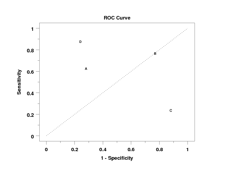
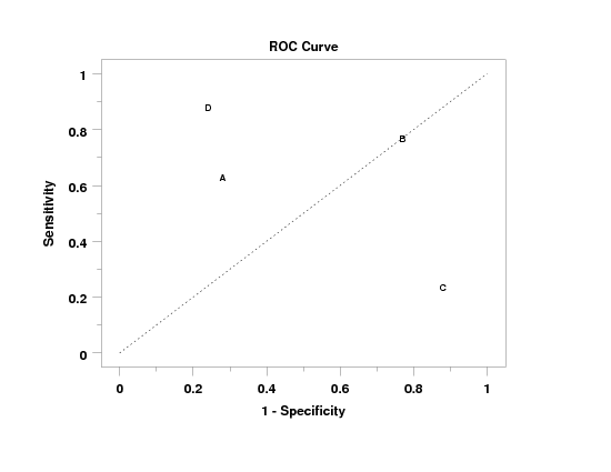
Some guidelines for interperting the ROC curve are:
- Points in the upper left corner denote high
accuracy.
- Dataplot draws a line from the (0,0) point to the
(1,1) point. This is referred to as the no
discrimination line. Points falling on this line
indicate a test that is no better than flipping a
coin.
For the case where we are changing the threshold of a
test, the ROC curves does an excellent job of demonstrating
the tradeoff between specificity and sensitivity. That is,
as we decrease the chance of a false negative (i.e., we do
not miss detection), we inevitably increase the chance of
a false positive. So what we are looking for is a test
that follows the left x-axis and then the top y-axis. In
other words, the closer the curve is to the no discrimination
line, the poorer the test.
Note:
The three (or four) variables must have the same number of
elements.
Note:
There are two ways you can define the response variables:
- Raw data - in this case, the variables contain
0's and 1's.
If the data is not coded as 0's and 1's, Dataplot
will check for the number of distinct values. If
there are two distinct values, the minimum value
is converted to 0's and the maximum value is
converted to 1's. If there is a single distinct
value, it is converted to 0's if it is less than
0.5 and to 1's if it is greater than or equal to
0.5. If there are more than two distinct values,
an error is returned.
- Summary data - if there are two observations, the
data is assummed to be the 2x2 summary table.
That is,
Y1(1) = N11
Y1(2) = N21
Y2(1) = N12
Y2(2) = N22
Note:
As noted above, there are two distinct cases for which ROC
curves can be used. Consider the example where we are testing
whether an instrument can detect some specified object.
- In one case, we may want to compare instruments from
different vendors. In this case, the ROC curve
would be used to help determine which vendor
has the best instrument.
- In the other case, we may be able to change the
level at which we determine whether or not we
have detected the object. In this case, the
ROC curve can be used to help determine an
optimal setting for the instrument. In this case,
there is typically a trade-off between sensitivity
and specificity (i.e., as our instrument becomes
more sensitive to the prescence of the object,
we also increase the probability of a false
positive).
Of course, we can have a combination of these cases
(i.e., multiple instruments each with multiple possible
settings).
Note:
You can control the appearance of the plot using the
LINE and CHARACTER (and their various attribute setting
commands).
For Syntax 1, the following traces are generated for the
plot:
- trace 1 - a line from (0,0) to (1,1). This is the
"no discrimination line".
- trace 2 - a curve containing all the points on the
ROC curve.
- trace 3 and above - each point is drawn as a separate
trace. This is useful for the case when each point
represents a distinct instrument.
For Syntax 2, the following traces are generated for the
plot:
- trace 1 - a line from (0,0) to (1,1). This is the
"no discrimination line".
- trace 2 and above - each curve contains all the settings
for one group (i.e., trace 2 contains the settings for
group 1, trace 3 contains the settings for group 2, and
so on).
Note:
Dataplot automatically returns the area under the curve
as the parameter AUC (points are added at (0,0) and (1,1)).
This area is determined by numerical integration.
This statistic is only meaningful for the case where we
are plotting different settings of the same instrument.
For the case where we have multiple settings for multiple
vendors, we write the AUC statistic to the file
dpst1f.dat (in the current directory). Column 1 contains
the group-id value and column 2 contains the value of the
AUC statistic for that group.
Default:
Synonyms:
Related Commands:
Reference:
Hosmer and Lemeshow (2000), "Applied Logistic Regression",
Second Edition, Wiley, pp. 160-164.
Applications:
Categorical Data Analysis
Implementation Date:
2007/7: Support for syntax 2 added
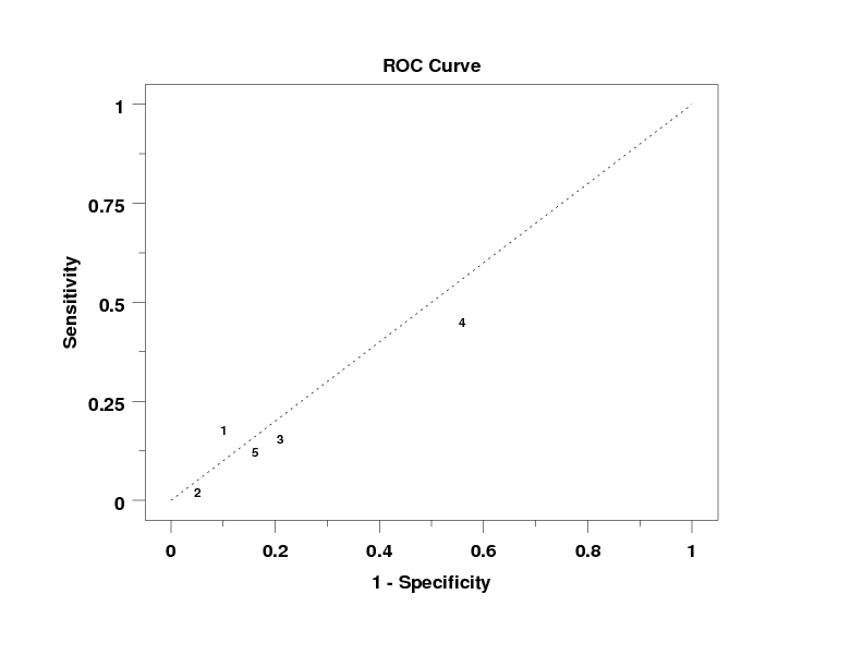
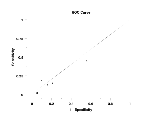
Program 1:
let n = 1
.
let p = 0.2
let y1 = binomial rand numb for i = 1 1 100
let p = 0.1
let y2 = binomial rand numb for i = 1 1 100
.
let p = 0.4
let y1 = binomial rand numb for i = 101 1 200
let p = 0.08
let y2 = binomial rand numb for i = 101 1 200
.
let p = 0.15
let y1 = binomial rand numb for i = 201 1 300
let p = 0.18
let y2 = binomial rand numb for i = 201 1 300
.
let p = 0.6
let y1 = binomial rand numb for i = 301 1 400
let p = 0.45
let y2 = binomial rand numb for i = 301 1 400
.
let p = 0.3
let y1 = binomial rand numb for i = 401 1 500
let p = 0.1
let y2 = binomial rand numb for i = 401 1 500
.
let x = sequence 1 100 1 5
.
limits 0  1
major xtic mark number 6
minor xtic mark number 1
tic mark offset 0.05 0.05
.
character blank blank 1 2 3 4 5
line blank all
line dotted
.
title case asis
title offset 2
title ROC Curve
y1label Sensitivity
x1label 1 - Specificity
.
roc curve y1 y2 x
Program 2:
.  Following sample data from Wikipedia site
read y1 y2 x
63 37 1
28 72 1
77 23 2
77 23 2
24 76 3
88 12 3
88 12 4
24 76 4
end of data
.
character blank blank A B C D
line blank all
line dotted
limits 0 1
major tic mark number 6
minor tic mark number 1
tic mark offset 0.05 0.05
.
label case asis
title case asis
title offset 2
title ROC Curve
y1label Sensitivity
x1label 1 - Specificity
.
roc curve y1 y2 x
Date created: 07/25/2007
Last updated: 12/04/2023
Please email comments on this WWW page to
[email protected].
|
|