
1.4. EDA Case Studies
1.4.2. Case Studies
1.4.2.3. Random Walk
1.4.2.3.2. |
Test Underlying Assumptions |
- Determine if the univariate model:
-
\( Y_{i} = C + E_{i} \)
is appropriate and valid.
- Determine if the typical underlying assumptions for an
"in control" measurement process are valid. These assumptions
are:
- random drawings;
- from a fixed distribution;
- with the distribution having a fixed location; and
- the distribution having a fixed scale.
- Determine if the confidence interval
-
\( \bar{Y} \pm 2s/\sqrt{N} \)
is appropriate and valid, with s denoting the standard deviation of the original data.
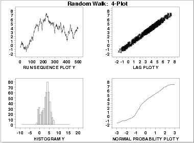
- The run sequence plot
(upper left) indicates significant
shifts in location over time.
- The lag plot
(upper right) indicates significant non-randomness in the data.
- When the assumptions of randomness and constant location and scale are not satisfied, the distributional assumptions are not meaningful. Therefore we do not attempt to make any interpretation of the histogram (lower left) or the normal probability plot (lower right).
When the randomness assumption is seriously violated, a time series model may be appropriate. The lag plot often suggests a reasonable model. For example, in this case the strongly linear appearance of the lag plot suggests a model fitting Yi versus Yi-1 might be appropriate. When the data are non-random, it is helpful to supplement the lag plot with an autocorrelation plot and a spectral plot. Although in this case the lag plot is enough to suggest an appropriate model, we provide the autocorrelation and spectral plots for comparison.
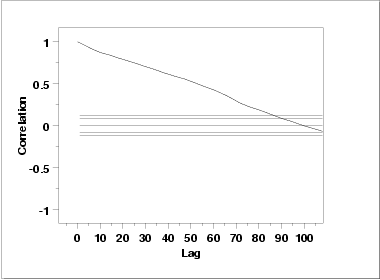
This autocorrelation plot shows significant autocorrelation at lags 1 through 100 in a linearly decreasing fashion.
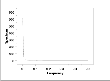
This spectral plot shows a single dominant low frequency peak.
      Sample size  = 500
      Mean         =   3.216681
      Median       =   3.612030
      Minimum      =  -1.638390
      Maximum      =   7.415205
      Range        =   9.053595
      Stan. Dev.   =   2.078675
We also computed the
autocorrelation to be
0.987, which is evidence of a very strong autocorrelation.
      Coefficient      Estimate     Stan. Error   t-Value
          B0         1.83351         0.1721        10.650
          B1         0.552164E-02    0.5953E-03     9.275

      Residual Standard Deviation = 1.9214
      Residual Degrees of Freedom = 498
The t-value of the slope
parameter, 9.275, is larger than the critical value of
t0.975,498 = 1.96. Thus, we conclude that the slope is
different from zero at the 0.05 significance level.
      H0:  σ12 = σ22 = σ32 = σ42
      Ha:  At least one σi2 is not equal to the others.

      Test statistic:  W = 10.459
      Degrees of freedom:  k - 1 = 3
      Significance level:  α = 0.05
      Critical value:  Fα,k-1,N-k = 2.623
      Critical region:  Reject H0 if W > 2.623
In this case, the Levene test indicates that the variances
are significantly different in the four intervals
since the test statistic of 10.459 is greater than the 95 %
critical value of 2.623. Therefore we conclude that the scale
is not constant.
      H0:  the sequence was produced in a random manner
      Ha:  the sequence was not produced in a random manner

      Test statistic:  Z = -20.3239
      Significance level:  α = 0.05
      Critical value:  Z1-α/2 = 1.96
      Critical region:  Reject H0 if |Z| > 1.96
The runs test rejects the null hypothesis that the data were
produced in a random manner at the 0.05 significance level.
