
1.3. EDA Techniques
1.3.3. Graphical Techniques: Alphabetic
1.3.3.1. |
Autocorrelation Plot |
Check Randomness
In addition, autocorrelation plots are used in the model identification stage for Box-Jenkins autoregressive, moving average time series models.
An example of where a more rigorous check for randomness is needed would be in testing random number generators.
Autocorrelations should be near-zero for randomness. Such is not the case in this example and thus the randomness assumption fails
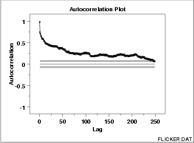
This sample autocorrelation plot of the FLICKER.DAT data set shows that the time series is not random, but rather has a high degree of autocorrelation between adjacent and near-adjacent observations.
r(h) versus h
- Vertical axis: Autocorrelation coefficient
-
\[ R_{h} = C_{h}/C_{0} \]
where Ch is the autocovariance function
-
\[ C_{h} = \frac{1}{N}\sum_{t=1}^{N-h}(Y_{t} -
\bar{{Y}})(Y_{t+h} - \bar{{Y}}) \]
and C0 is the variance function
-
\[ C_{0} = \frac{\sum_{t=1}^{N}(Y_{t} - \bar{Y})^2}{N} \]
Note that Rh is between -1 and +1.
Note that some sources may use the following formula for the autocovariance function
-
\[ C_{h} = \frac{1}{N-h}\sum_{t=1}^{N-h}(Y_{t} -
\bar{{Y}})(Y_{t+h} - \bar{{Y}}) \]
Although this definition has less bias, the (1/N) formulation has some desirable statistical properties and is the form most commonly used in the statistics literature. See pages 20 and 49-50 in Chatfield for details.
- Horizontal axis: Time lag h (h = 1, 2, 3, ...)
- The above line also contains several horizontal reference
lines. The middle line is at zero. The other four lines
are 95 % and 99 % confidence bands. Note that there are
two distinct formulas for generating the confidence bands.
- If the autocorrelation plot is being used to test for
randomness (i.e., there is no time dependence in the
data), the following formula is recommended:
-
\[ \pm \frac{z_{1-\alpha/2}} {\sqrt{N}} \]
where N is the sample size, z is the cumulative distribution function of the standard normal distribution and \( \alpha \) is the significance level. In this case, the confidence bands have fixed width that depends on the sample size. This is the formula that was used to generate the confidence bands in the above plot.
- Autocorrelation plots are also used in the model
identification stage for fitting
ARIMA models.
In this case, a moving average model is assumed for the data
and the following confidence bands should be generated:
-
\[ \pm z_{1-\alpha/2} \sqrt{\frac{1}{N}
(1 + 2 \sum_{i=1}^{k}{y_{i}^2})} \]
where k is the lag, N is the sample size, z is the cumulative distribution function of the standard normal distribution and \( \alpha \) is the significance level. In this case, the confidence bands increase as the lag increases.
- If the autocorrelation plot is being used to test for
randomness (i.e., there is no time dependence in the
data), the following formula is recommended:
- Are the data random?
- Is an observation related to an adjacent observation?
- Is an observation related to an observation twice-removed? (etc.)
- Is the observed time series white noise?
- Is the observed time series sinusoidal?
- Is the observed time series autoregressive?
- What is an appropriate model for the observed time series?
- Is the model
-
Y = constant + error
valid and sufficient?
- Is the formula \[ s_{\bar{{Y}}} = s/\sqrt{N} \] valid?
Ensure validity of engineering conclusions
Randomness (along with fixed model, fixed variation, and fixed distribution) is one of the four assumptions that typically underlie all measurement processes. The randomness assumption is critically important for the following three reasons:
- Most standard statistical tests depend on randomness. The
validity of the test conclusions is directly linked to the
validity of the randomness assumption.
- Many commonly-used statistical formulae depend on the
randomness assumption, the most common formula being the
formula for determining the standard deviation of the sample
mean:
-
\[ s_{\bar{{Y}}} = s/\sqrt{N} \]
where s is the standard deviation of the data. Although heavily used, the results from using this formula are of no value unless the randomness assumption holds.
- For univariate data, the default model is
-
Y = constant + error
If the data are not random, this model is incorrect and invalid, and the estimates for the parameters (such as the constant) become nonsensical and invalid.
Lag Plot
Spectral Plot
Seasonal Subseries Plot
