Next Page Previous Page Home Tools & Aids Search Handbook
1. Exploratory Data Analysis
1.3. EDA Techniques
1.3.3. Graphical Techniques: Alphabetic
1.3.3.1. Autocorrelation Plot

1.3.3.1.3.

Autocorrelation Plot: Strong Autocorrelation and Autoregressive Model

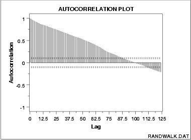
Autocorrelation Plot for Strong Autocorrelation The following is a sample autocorrelation plot of a random walk data set.

autocorrelation plot showing strong autocorrelation

Conclusions We can make the following conclusions from the above plot.
  1. The data come from an underlying autoregressive model with strong positive autocorrelation.
Discussion The plot starts with a high autocorrelation at lag 1 (only slightly less than 1) that slowly declines. It continues decreasing until it becomes negative and starts showing an incresing negative autocorrelation. The decreasing autocorrelation is generally linear with little noise. Such a pattern is the autocorrelation plot signature of "strong autocorrelation", which in turn provides high predictability if modeled properly.
Recommended Next Step The next step would be to estimate the parameters for the autoregressive model:
    \[ Y_{i} = A_0 + A_1*Y_{i-1} + E_{i} \]
Such estimation can be performed by using least squares linear regression or by fitting a Box-Jenkins autoregressive (AR) model.

The randomness assumption for least squares fitting applies to the residuals of the model. That is, even though the original data exhibit non-randomness, the residuals after fitting Yi against Yi-1 should result in random residuals. Assessing whether or not the proposed model in fact sufficiently removed the randomness is discussed in detail in the Process Modeling chapter.

The residual standard deviation for this autoregressive model will be much smaller than the residual standard deviation for the default model

    \[ Y_{i} = A_0 + E_{i} \]
Home Tools & Aids Search Handbook Previous Page Next Page