Next Page Previous Page Home Tools & Aids Search Handbook
1. Exploratory Data Analysis
1.3. EDA Techniques
1.3.3. Graphical Techniques: Alphabetic

1.3.3.26.

Scatter Plot

Purpose:
Check for Relationship
A scatter plot (Chambers 1983) reveals relationships or association between two variables. Such relationships manifest themselves by any non-random structure in the plot. Various common types of patterns are demonstrated in the examples.
Sample Plot:
Linear Relationship Between Variables Y and X
scatter plot revealing a near-linear relationship between variables X and Y

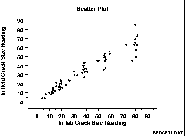
This sample plot of the Alaska pipeline data reveals a linear relationship between the two variables indicating that a linear regression model might be appropriate.

Definition:
Y Versus X
A scatter plot is a plot of the values of Y versus the corresponding values of X:
  • Vertical axis: variable Y--usually the response variable
  • Horizontal axis: variable X--usually some variable we suspect may ber related to the response
Questions Scatter plots can provide answers to the following questions:
  1. Are variables X and Y related?
  2. Are variables X and Y linearly related?
  3. Are variables X and Y non-linearly related?
  4. Does the variation in Y change depending on X?
  5. Are there outliers?
Examples
  1. No relationship
  2. Strong linear (positive correlation)
  3. Strong linear (negative correlation)
  4. Exact linear (positive correlation)
  5. Quadratic relationship
  6. Exponential relationship
  7. Sinusoidal relationship (damped)
  8. Variation of Y doesn't depend on X (homoscedastic)
  9. Variation of Y does depend on X (heteroscedastic)
  10. Outlier
Combining Scatter Plots Scatter plots can also be combined in multiple plots per page to help understand higher-level structure in data sets with more than two variables.

The scatterplot matrix generates all pairwise scatter plots on a single page. The conditioning plot, also called a co-plot or subset plot, generates scatter plots of Y versus X dependent on the value of a third variable.

Causality Is Not Proved By Association The scatter plot uncovers relationships in data. "Relationships" means that there is some structured association (linear, quadratic, etc.) between X and Y. Note, however, that even though

    causality implies association

    association does NOT imply causality.

Scatter plots are a useful diagnostic tool for determining association, but if such association exists, the plot may or may not suggest an underlying cause-and-effect mechanism. A scatter plot can never "prove" cause and effect--it is ultimately only the researcher (relying on the underlying science/engineering) who can conclude that causality actually exists.
Appearance The most popular rendition of a scatter plot is

  1. some plot character (e.g., X) at the data points, and
  2. no line connecting data points.

Other scatter plot format variants include

  1. an optional plot character (e.g, X) at the data points, but
  2. a solid line connecting data points.

In both cases, the resulting plot is referred to as a scatter plot, although the former (discrete and disconnected) is the author's personal preference since nothing makes it onto the screen except the data--there are no interpolative artifacts to bias the interpretation.

Related Techniques Run Sequence Plot
Box Plot
Block Plot
Case Study The scatter plot is demonstrated in the load cell calibration data case study.
Software Scatter plots are a fundamental technique that should be available in any general purpose statistical software program. Scatter plots are also available in most graphics and spreadsheet programs as well.
Home Tools & Aids Search Handbook Previous Page Next Page