1.3. EDA Techniques
1.3.3. Graphical Techniques: Alphabetic
1.3.3.26. Scatter Plot
1.3.3.26.11. |
Scatter Plot Matrix |
Check pairwise relationships between variables
Although the basic concept of the scatter plot matrix is simple, there are numerous alternatives in the details of the plots.
- The diagonal plot is simply a 45 degree line since we
are plotting Xi versus
Xi. Although this has some
usefulness in terms of showing the univariate distribution
of the variable, other alternatives are common. Some
users prefer to use the diagonal to print the variable label.
Another alternative is to plot the univariate histogram on
the diagonal. Alternatively, we could simply leave the
diagonal blank.
- Since Xi versus
Xj is equivalent to
Xj versus
Xi with the axes reversed, some
prefer to omit the plots below the diagonal.
- It can be helpful to overlay some type of fitted curve
on the scatter plot. Although a linear or quadratic fit
can be used, the most common alternative is to overlay
a lowess
curve.
- Due to the potentially large number of plots, it can be
somewhat tricky to provide the axes labels in a way that is
both informative and visually pleasing. One alternative that
seems to work well is to provide axes labels on alternating
rows and columns. That is, row one will have tic marks
and axis labels on the left vertical axis for the first
plot only while row two will have the tic marks and axis
labels for the right vertical axis for the last plot in the
row only. This alternating pattern continues for the
remaining rows. A similar pattern is used for the columns
and the horizontal axes labels. Another alternative is to
put the minimum and maximum scale value in the diagonal plot
with the variable name.
- Some analysts prefer to connect the scatter plots. Others
prefer to leave a little gap between each plot.
- Although this plot type is most commonly used for scatter plots, the basic concept is both simple and powerful and extends easily to other plot formats that involve pairwise plots such as the quantile-quantile plot and the bihistogram.

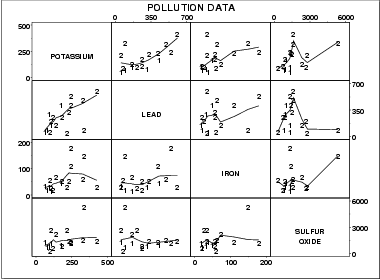
This sample plot was generated from pollution data collected by NIST chemist Lloyd Currie.
There are a number of ways to view this plot. If we are primarily interested in a particular variable, we can scan the row and column for that variable. If we are interested in finding the strongest relationship, we can scan all the plots and then determine which variables are related.
The individual plot for row i and column j is defined as
- Vertical axis: Variable Xi
- Horizontal axis: Variable Xj
- Are there pair wise relationships between the variables?
- If there are relationships, what is the nature of these relationships?
- Are there outliers in the data?
- Is there clustering by groups in the data?
By linking, we mean showing how a point, or set of points, behaves in each of the plots. This is accomplished by highlighting these points in some fashion. For example, the highlighted points could be drawn as a filled circle while the remaining points could be drawn as unfilled circles. A typical application of this would be to show how an outlier shows up in each of the individual pairwise plots. Brushing extends this concept a bit further. In brushing, the points to be highlighted are interactively selected by a mouse and the scatter plot matrix is dynamically updated (ideally in real time). That is, we can select a rectangular region of points in one plot and see how those points are reflected in the other plots. Brushing is discussed in detail by Becker, Cleveland, and Wilks in the paper "Dynamic Graphics for Data Analysis" (Cleveland and McGill, 1988).
Scatter plot
Conditioning plot
Locally weighted least squares

