
|
|
PERCENT POINT PLOTName:
Thus, for example, if the value of 50 is chosen on the horizontal axis, then the corresponding value on the vertical axis is the estimated 50% point (that is, the median) from the data. The percent point plot can be generated for either raw data or for binned data. For raw data, the percentile plot is constructed by plotting the sorted data on the vertical axis. The corresponding horizontal axis value for the i-th point is 100*Yi/N with Yi and N denoting the i-th observation of the sorted data and the sample size, respectively. The multiplication by 100 is to covert the horizontal axis to a percentage value. For binned data, the vertical axis value is the mid-point of the bin. The corresponding horizontal axis values are the cumulative sums of the frequencies of the bins divided by the sum of the frequencies for all bins. This value is multiplied by 100 to convert the horizontal axis to a percentage value. By default, raw data is first binned into frequency data. To suppress this binning (i.e., generate the raw data version of the plot), enter the command
To restore the default of binning raw data, enter
Typically no binning is preferred for small to moderate size data sets. Binning can be helpful for large data sets in that it reduces the number of points that are plotted.
where <x> is the variable of raw data; and where the <SUBSET/EXCEPT/FOR qualification> is optional. This syntax is used for the case where you have raw data.
where <y> is the variable of pre-computed frequencies; <x> is the variable of distinct values; and where the <SUBSET/EXCEPT/FOR qualification> is optional. This syntax is used for the case where you have pre-computed frequencies at each data level. This syntax is used when you have equal width bins.
<SUBSET/EXCEPT/FOR qualification> where <y> is the variable of pre-computed frequencies; <xlow> is the variable containing the lower limits of the bins; <xhigh> is the variable containing the upper limits of the bins; and where the <SUBSET/EXCEPT/FOR qualification> is optional. This syntax is used for the case where you have pre-computed frequencies at each data level. This syntax is used when you have unequal width bins.
<SUBSET/EXCEPT/FOR qualification> where <y1> ... <yk> is a list of 1 to 30 response variables; and where the <SUBSET/EXCEPT/FOR qualification> is optional. This syntax will generate percent point plots of each of the listed response variables on the same plot. You can specify different plot attributes for each response variable. This syntax is only supported for raw data (i.e., no binned data).
<SUBSET/EXCEPT/FOR qualification> where <y> is the response variable; <x1> ... <xk> is a list of 1 to 6 group-id variables; and where the <SUBSET/EXCEPT/FOR qualification> is optional. From one to six group-id variables can be specified (most commonly there is a single group-id variable). Note that with this syntax, the plot points corresponding to each group are drawn with different attributes (i.e., the first group uses the first setting for the CHARACTER and LINE and related attribute setting commands, the second group uses the second setting, and so on). For example, this syntax can be used to label the plot points with the group-id. If there is more than one group-id variable, the attribute settings work from right to left. That is, if X1 has 2 levels and X2 has 2 levels, then
<SUBSET/EXCEPT/FOR qualification> where <y> is the response variable; <x> is a group-id variable; and where the <SUBSET/EXCEPT/FOR qualification> is optional. Although this syntax is similar to the REPLICATION case, it is generally used in a different way. The REPLICATION case is used when we have distinct groups of data and we want to generate separate percent point plots for each group. Highlighting is used when we have a single group of data, but we want to draw some of the points with different attributes. For example, we may want to emphasize the extreme points in the plot.
PERCENT POINT Y X PERCENT POINT Y XLOW XHIGH HIGHTLIGHTED PERCENT POINT Y TAG MULTIPLE PERCENT POINT Y1 Y2 Y3 PERCENT POINT Y X SUBSET X > 2
The SET HISTOGRAM CLASS WIDTH can be used to define several other algorithms for binning the data (HELP HISTOGRAM CLASS WIDTH for details). The SET HISTOGRAM OUTLIERS command also applies to the PERCENT POINT PLOT if raw data is being binned.
1998/09: Support for SET PERCENT POINT PLOT command. 2011/02: Support for REPLICATION and MULTIPLE options. 2011/02: Support for HIGHLIGHT option.
SKIP 25
READ SUNSPOT2.DAT Y
.
LET ALOW = MINIMUM Y
LET AHIGH = MAXIMUM Y
CLASS LOWER ALOW
CLASS UPPER AHIGH
CLASS WIDTH 1.0
CHARACTER CIRCLE
CHARACTER FILL ON
CHARACTER SIZE 1.2
X1LABEL PERCENT POINT
Y1LABEL DATA VALUE
TITLE AUTOMATIC
.
PERCENT POINT PLOT Y
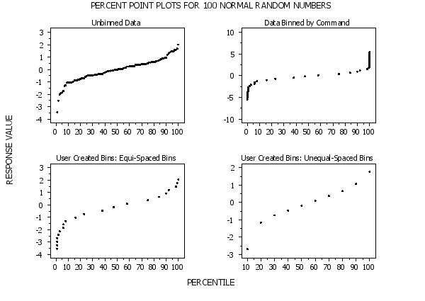
 Program 2:
let y1 = norm rand numb for i = 1 1 100
.
title case asis
title offset 2
title automatic
label case asis
tic mark offset units screen
tic mark offset 3 3
.
char circle
char fill on
char hw 0.5 0.375
line blank
.
multiplot corner coordinates 5 5 95 95
multiplot scale factor 2
multiplot 2 2
.
set percent point plot unbinned
set histogram outliers on
set histogram empty bins off
title Unbinned Data
percent point plot y1
.
set percent point plot binned
title Data Binned by Command
percent point plot y1
.
title User Created Bins: Equi-Spaced Bins
let z2 x2 = binned y1
percent point plot z2 x2
.
let minsize = 5
let z3 xlow xhigh = combine frequency table z2 x2
title User Created Bins: Unequal-Spaced Bins
percent point plot z3 xlow xhigh
.
end of multiplot
justification center
move 50 97
text Percent Point Plots for 100 Normal Random Numbers
move 50 5
text Percentile
direction vertical
move 3 50
text Response Value
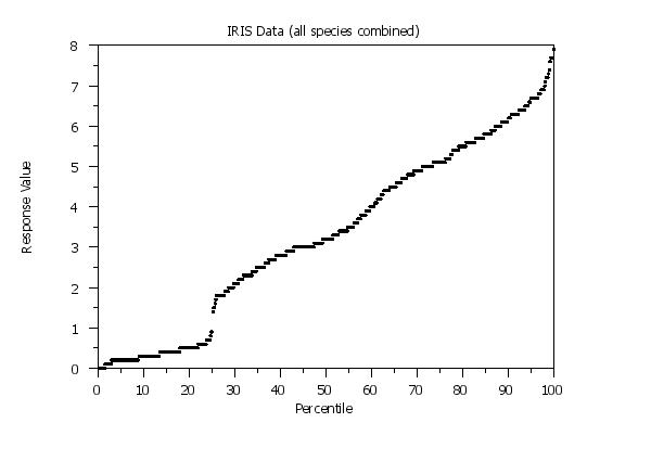
 Program 3:
dimension 500 rows
skip 25
read iris.dat y1 y2 y3 y4
let m = create matrix y1 y2 y3 y4
.
title case asis
title offset 2
label case asis
.
char circle all
char color black
char fill on all
char hw 0.5 0.375 all
line blank all
.
y1label Response Value
x1label Percentile
title IRIS Data (all species combined)
.
set percent point plot unbinned
set histogram outliers on
set histogram empty bins off
percent point plot m
.
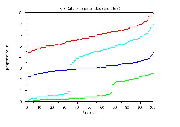
char color red blue cyan green
title IRIS Data (species plotted separately)
multiple percent point plot y1 to y4
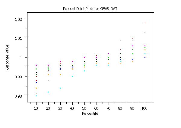
skip 25
read gear.dat y x
.
title case asis
title offset 2
label case asis
tic mark offset units screen
tic mark offset 5 5
.
char circle all
char color black red blue green cyan grey brown magenta dgreen orange
char fill on all
char hw 0.5 0.375 all
line blank all
.
title Percent Point Plots for GEAR.DAT
y1label Response Value
x1label Percentile
.
set percent point plot unbinned
set histogram outliers on
set histogram empty bins off
replicated percent point plot y x
Date created: 06/04/2016 |
Last updated: 12/04/2023 Please email comments on this WWW page to [email protected]. | ||||||||||||||||||||||||||||||||||||||||||||
 Program 4: