
|
|
CONTROL CHARTName:
For each of the supported control charts, limits have been determined for signaling when a response is "out of control". That is, if the points on the control chart are within the control limits, the data is considered "in control". When a point is outside these control limits, the data is considered "out of control" and the process should be examined to determine the cause. In developing the control limits, an effort is made to balance quick detection while minimizing "false positives" (i.e., signaling that a process is out of control when it is in fact still in control). Quick detection is desired to minimize the number of potentially bad units produced. Minimizing false positives is desired since shutting down the process can result in unnecessarily lost production (and possibly significant cost). The mean control chart is the most commonly used control chart for detecting a change in location. The CUSUM and EWMA charts were developed to detect small shifts of location. The standard deviation control chart and range control chart are the primary control charts for detecting a change in the variability of a process. Typically, the data for control charts is divided into batches (sub-groups) and the appropriate statistic is computed and plotted for each sub-group. The MOVING control charts are used for the case when the data are not divided into sub-groups. The ISO control chart is a variant of control charts used in the ISO 13528 standard for proficiency studies for multiple rounds. There is separate documentation for the mean, standard deviation, range, cusum, ewma, and the various proportion and counts control charts. This documentation may contain more details for that specific type of control chart. The control chart consists of:
In addition, horizontal lines are drawn at the mean (i.e., the mean of the means, ranges, standard deviations, or other appropriate statistic) and at the upper and lower control limits.
where <stat> is one of XBAR (or MEAN), R (or RANGE), S (or SD), CUSUM, or EWMA; <y> is the response variable; <x> is a variable containing the sub-group identifications; and where the <SUBSET/EXCEPT/FOR qualification> is optional. Enter one of MEAN, RANGE, S, CUSUM, or EWMA to specify what type of control chart to generate.
where <stat> is one of AVERAGE, RANGE, or SD; <y> is the response variable; and where the <SUBSET/EXCEPT/FOR qualification> is optional.
where <y> is the response variable containing the number of defectives for each sub-group; <size> is a variable containing the sample size for each sub-group; <x> is a variable containing the sub-group identifications; and where the <SUBSET/EXCEPT/FOR qualification> is optional. If P is specified, then the percentage of defectives is plotted. If NP is specified, then the number of defectives is plotted.
where <y> is the response variable containing the number of defectives for each sub-group; <x> is a variable containing the sub-group identifications; and where the <SUBSET/EXCEPT/FOR qualification> is optional. The C chart is used for Poisson counts. For the Poisson counts case, you can have either an area of material that is being inspected or a sample size. The C chart is used when the sub-groups have constant area (or equal sample size).
where <y> is the response variable containing the number of defectives for each sub-group; <area> is a variable containing the sample size or area adjustment for each sub-group; <x> is a variable containing the sub-group identifications; and where the <SUBSET/EXCEPT/FOR qualification> is optional. The U chart is used for Poisson counts. For the Poisson counts case, you can have either an area of material that is being inspected or a sample size. The U chart is used when the sub-groups have unequal area (or unequal sample size).
where <y> is the response variable; <x> is a variable containing the sub-group identifications; and where the <SUBSET/EXCEPT/FOR qualification> is optional. This is a variant of the mean control chart. This chart is constructed as follows:
For the ISO 13528 control chart, the sub-groups are typically the different laboratories. The ISO 13528 control chart is used to identify laboratories that are not consistent with the other laboratories in the proficiency study.
RANGE CONTROL CHART Y X S CONTROL CHART Y X MOVING AVERAGE CONTROL CHART Y X
One of the motivations for control charts is to detect problems during production rather than after production. That is, if a production problem can be detected early, then this can help minimize the number of defective units produced.
LET USL = <value> LET LSL = <value> This sets the target value, the upper control limit, and the lower control limit respectively.
For example, some analysts prefer to draw the value of the statistic as a character or spike rather than a connected line. If you include both Dataplot calculated and user-specified limits, you may want to draw them with different colors or different line styles. For the other control charts, the documentation for the specific control charts provides a similar listing for the mapping of traces to chart features. These may vary somewhat from the above list.
The HOTELLING CONTROL CHART can be used to simultaneously monitor multiple response variables for a shift in location. Although you can monitor multiple response variables with individual mean control charts, this assumes that the response variables are independent. The Hotelling control chart takes the correlation structure into account.
The command
can be used to specify the control limits used. DEFAULT uses the standard control chart limits. WECO uses the Western Electric guidlines. ISO 13528 uses the +/-2 and +/-3 limits (this assumes the response variable has been transformed to a z-score). Note that the if the WECO rules are turned on, the following is done:
The WECO rules have been criticized for generating too many false positives.
The 2012/02 version added the HIGHLIGHT option. This is demonstrated in the Program 2 example below.
STANDARD DEVIATION CONTROL CHART for S CONTROL CHART
Kaoru Ishikawa (1982), "Guide to Quality Control," Asian Productivity Organization, (Chapter 7). Thomas Ryan (1989), "Statistical Methods for Quality Improvement", Wiley. Douglas Montgomery (2001), "Introduction to Statistical Quality Control", Fourth Edition, Wiley. ISO 13528 (2005), "Statistical Methods for use in proficiency testing by interlaboratory comparisons," First Edition, 2005-09-01.
1988/01: Support for P, PN, U, and C charts 1990/07: Support for user specified control limits 1997/03: Support for CUSUM and EWMA charts 1997/03: Support for moving average, moving range and moving sd charts 2012/01: Support for highlighting option 2012/01: Support for WECO and ISO 13528 control limits 2012/02: Support for ISO 13528 control chart
SKIP 25
READ CROARK3.DAT Y X
.
MULTIPLOT CORNER COORDINATES 2 2 98 98
MULTIPLOT SCALE FACTOR 2
MULTIPLOT 2 2
TITLE CASE ASIS
CASE ASIS
TITLE OFFSET 2
LINE BLANK SOLID DASH DASH DOTT DOTT
CHARACTER CIRCLE
CHARACTER FILL ON
CHARACTER HW 1 0.75
.
YLIMIT 0.5 0.6
MAJOR YTIC MARK NUMBER 6
Y1TIC MARK LABEL DECIMAL 2
XLIMITS 0 100
X1TIC MARK OFFSET 0 20
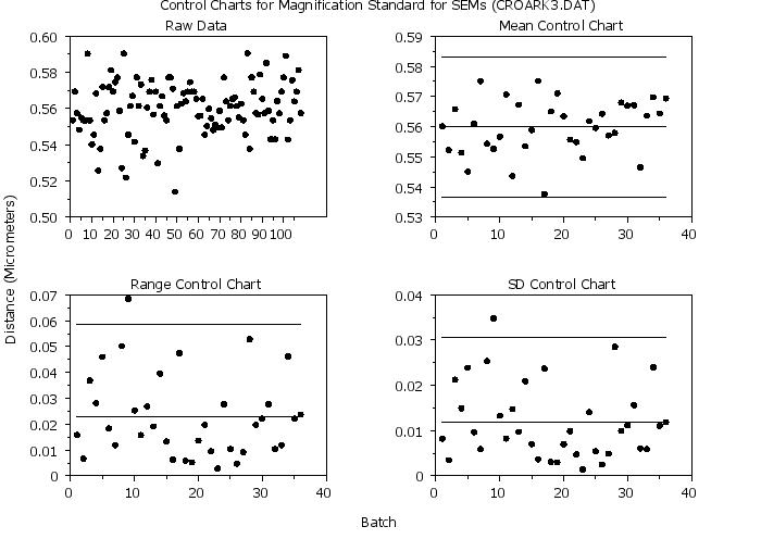
TITLE Raw Data
PLOT Y
.
YLIMIT
MAJOR YTIC MARK NUMBER
Y1TIC MARK LABEL DECIMAL
XLIMITS 0 40
X1TIC MARK OFFSET 0 0
TITLE Mean Control Chart
MEAN CONTROL CHART Y X
.
TITLE Range Control Chart
RANGE CONTROL CHART Y X
.
TITLE SD Control Chart
STANDARD DEVIATION CONTROL CHART Y X
.
END OF MULTIPLOT
MOVE 50 98
JUSTIFICATION CENTER
TEXT Control Charts for Magnification Standard for SEMs (CROARK3.DAT)
MOVE 50 2
TEXT Batch
DIRECTION VERTICAL
MOVE 2 50
TEXT Distance (Micrometers)
DIRECTION HORIZONTAL
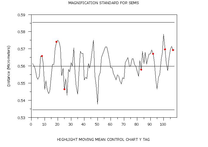
 Program 2:
SKIP 25 READ CROARK3.DAT Y X LET N = SIZE Y LET TAG = 0 FOR I = 1 1 N LET TAG = 1 SUBSET Y > 0.58 . SET WRITE DECIMALS 3 LABEL CASE ASIS CASE ASIS TITLE Magnification Standard for SEMs Y1LABEL Distance (Micrometers) XLIMITS 0 40 X3LABEL AUTOMATIC LINE SOLID SOLID DASH DASH BLANK CHARACTER BLANK BLANK BLANK BLANK CIRCLE CHARACTER FILL ON ALL CHARACTER HW 1 0.75 ALL CHARACTER COLOR RED ALL . HIGHLIGHT MEAN CONTROL CHART Y X TAG . 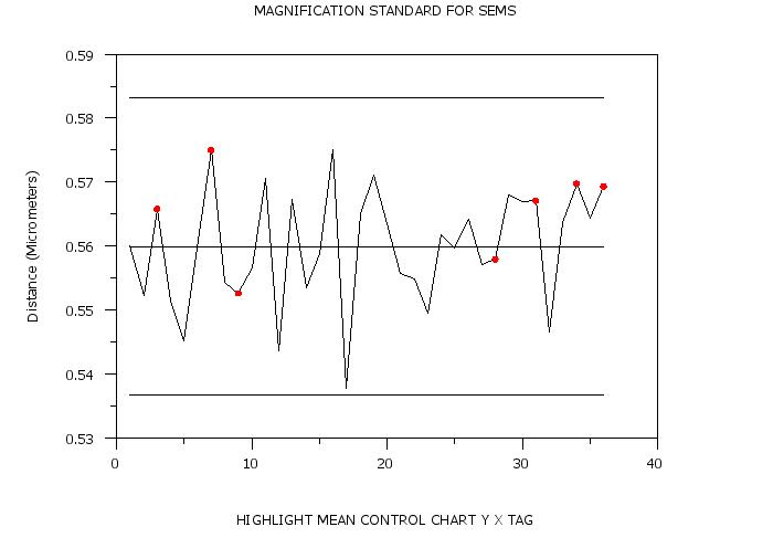
LET TAG = 0 FOR I = 1 1 N
LET TAG = 1 SUBSET Y > 0.58
LIMITS
XLIMITS 0 100
XTIC MARK OFFSET 0 10
HIGHLIGHT MOVING MEAN CONTROL CHART Y TAG
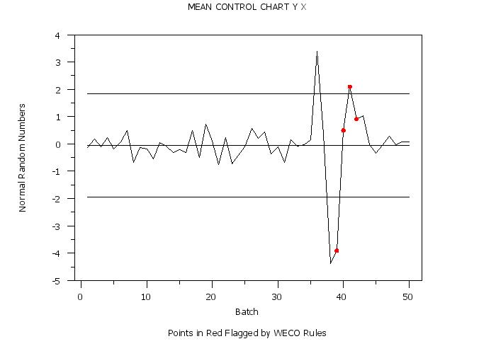
 Program 3:
LET X = SEQUENCE 1 10 1 50
LET Y = NORMAL RANDOM NUMBERS FOR I = 1 1 500
LET Y2 = Y
LET Y2 = 7*Y  FOR I = 351 1 425
LET Y = Y2
.
SET WRITE DECIMALS 3
LABEL CASE ASIS
CASE ASIS
Y1LABEL Normal Random Numbers
TITLE AUTOMATIC
LINE SOLID SOLID DASH DASH BLANK
CHARACTER BL BL BL BL CIRCLE
CHARACTER FILL ON ALL
CHARACTER HW 0.5 0.375 ALL
CHARACTER COLOR RED ALL
XLIMITS 0 50
XTIC MARK OFFSET 1 2
.
SET CONTROL CHART LIMITS WECO
MEAN CONTROL CHART Y X
 Program 4:
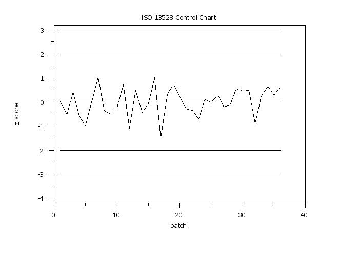
skip 25
read croark3.dat y roundid
skip 0
let n = size y
. let z = zscore y roundid
let z = zscore y
let matid = sequence 1 1 3 for i = 1 1 n
.
label case asis
y1label z-score
x1label batch
xlimits 0 35
x1tic mark offset 0 2
y1tic mark offset 0.2 0.2
title case asis
title offset 2
title ISO 13528 Control Chart
line      solid solid dash  dash  dash  dash  blank
character blank blank blank blank blank blank blank
character hw 1 0.75 all
character fill on all
.
iso 13528 control chart z roundid
.
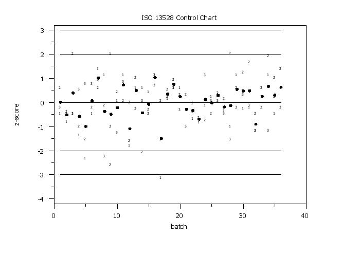
line blank solid dash dash dash dash blank blank blank
character circl blank blank blank blank blank 1 2 3
highlight iso 13528 control chart z roundid matid
 Program 5:
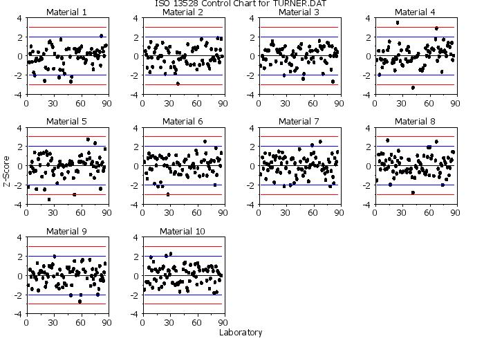
. Read data: Year is essentially the round and there are 10
.            materials.
skip 25
read turner.dat labid z year quart matid matave
skip 0
.
. Note that we want to generate the control chart treating
. laboratory as the "group-id" variable.  Generate a separate
. plot for each material.
.
case asis
label case asis
title case asis
title offset 2
line blank solid solid solid solid solid blank
line color black black blue blue red red black
character circle blank blank blank blank blank blank
character hw 1 0.75 all
character fill on all
.
multiplot corner coordinates 2 2 98 98
multiplot scale factor 3
multiplot 3 4
.
xlimits 0 90
major xtic mark number 4
ylimits -4 4
major ytic mark number 5
let nmat = unique matid
loop for k = 1 1 nmat
    title Material ^k
    iso 13528 control chart z labid subset matid k
end of loop
end of multiplot
.
justification center
move 50 98
text ISO 13528 Control Chart for TURNER.DAT
move 50 2
text Laboratory
direction vertical
move 2 50
text Z-Score
 Program 6:
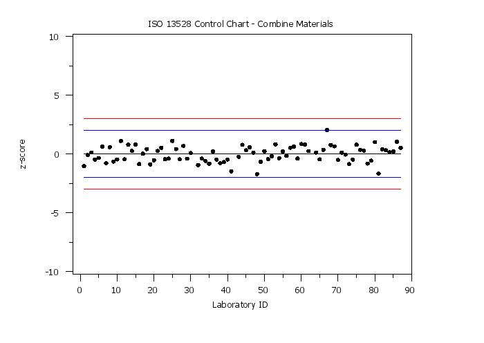
. Step 1:   Read the data
.
dimension 40 columns
skip 25
read turner.dat labid z year quarter matid matave
let roundid = year
skip 0
.
. Step 2:   Set plot control settings
.
case asis
label case asis
title case asis
title offset 2
.
y1label z-score
x1label Laboratory ID
xlimits 0 90
x1tic mark offset 2 0
ytic mark offset 0.2 0.2
.
line      blank solid solid solid solid solid blank
line color black black blue blue red red black
character circle blank blank blank blank blank blank
character hw 1 0.75
character fill on
.
. Step 3:   Generate 13528 Control Charts
.
title ISO 13528 Control Chart - Combine Materials
iso 13528 control chart z labid
.
line solid solid dash dash dash dash blank
character blank blank blank blank blank blank circle
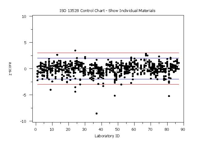
title ISO 13528 Control Chart - Show Individual Materials
iso 13528 control chart z labid
.
line blank all
line solid solid dash dash dash dash
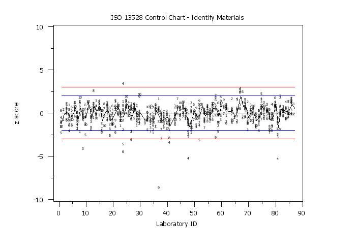
character blank blank blank blank blank blank 1 2 3 4 5 6 7 8 9 10
title ISO 13528 Control Chart - Identify Materials
highlight iso 13528 control chart z labid matid
Date created: 02/10/2015 |
Last updated: 12/04/2023 Please email comments on this WWW page to [email protected]. | ||||||||||||||||||||||||||||||||||||||||||||||||||||||||||||||||||||||||||||||||||||||||||||