|
|
MOVING STATISTIC CONTROL CHARTName:
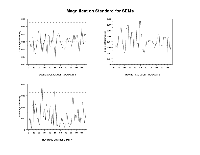
For ungrouped data, the moving average control chart is formed by plotting the moving average. The moving average depends on a filter width. For example, if this width is 3, then the first point plotted is the average of points one through three, the second poing plotted is the average of points two through five, and so on. The x coordinate is in the middle of the points (i.e., the x coordinate of the first point plotted is 2). In Dataplot, you specify the filter width by entering the following command before generating the control chart:
Filter widths are typically small (e.g., k = 3). The control limits are computed as
where \( \bar{X} \) is the overall mean, K is the filter width, and \( \bar{RM} \) is an estimate of \( \hat{\sigma} \) based on a moving range. Specifically, we compute a moving range comparable to the moving average described above and then we take the average of these moving ranges. Dataplot uses the same filter width for this moving range as it does for computing the moving average. E2 is a tabulated value. The technique for constucting moving range and moving standard deviation charts is similar. However, the control limits are:
where FACT is a tabulated value (it is different for the moving range and moving standard deviation control charts). In some cases, there may be historical data or engineering considerations that determine the control limits. You can set your own control limits by entering the commands:
LET USL = <value> LET LSL = <value> where TARGET is the desired target value and USL and LSL are the desired upper and lower control limits. You can control the appearance of this chart by setting the switches for the LINE, CHARACTER, SPIKE, and BAR commands appropriately. Specifically,
For example, to draw the EWMA values as a solid line and an X, the reference line and the Dataplot calculated control limits as dotted lines, and no user specified control limit, enter the commands:
CHARACTER X BLANK BLANK BLANK BLANK BLANK BLANK
<SUBSET/EXCEPT/FOR qualification> where <stat> is AVERAGE, RANGE, or SD; <y> is a response variable; <group> is a sub-group identifier variable; and where the <SUBSET/EXCEPT/FOR qualification> is optional. This syntax is used for grouped data.
<SUBSET/EXCEPT/FOR qualification> where <stat> is AVERAGE, RANGE, or SD; <y> is a response variable; and where the <SUBSET/EXCEPT/FOR qualification> is optional. This syntax is used for ungrouped data.
MOVING RANGE CONTROL CHART Y MOVING SD CONTROL CHART Y MOVING AVERAGE CONTROL CHART Y X MOVING AVERAGE CONTROL CHART Y X SUBSET X > 1
MOVING RANGE CHART is a synonym for MOVING RANGE CONTROL CHART. MOVING SD CHART is a synonym for MOVING SD CONTROL CHART.
CASE ASIS Y1LABEL Distance (Micrometers) LINE SOLID DOTT DOTT DOTT XLIMITS 0 100 XTIC OFFSET 2 10 X3LABEL AUTOMATIC . SKIP 25 READ CROARK3.DAT Y . MULTIPLOT CORNER COORDINATES 5 5 95 95 MULTIPLOT 2 2 MOVING AVERAGE CONTROL CHART Y MOVING RANGE CONTROL CHART Y MOVING SD CONTROL CHART Y END OF MULTIPLOT MOVE 50 95 JUSTIFICATION CENTER TEXT Magnification Standard for SEMs
Date created: 06/05/2001 |
Last updated: 12/04/2023 Please email comments on this WWW page to [email protected]. | ||||||||||||||||||||||||