
1.3. EDA Techniques
1.3.3. Graphical Techniques: Alphabetic
1.3.3.11. |
DOE Scatter Plot |
Determine Important Factors with Respect to Location and Scale
DOE scatter plots are typically used in conjunction with the DOE mean plot and the DOE standard deviation plot. The DOE mean plot replaces the raw response values with mean response values while the DOE standard deviation plot replaces the raw response values with the standard deviation of the response values. There is value in generating all 3 of these plots. The DOE mean and standard deviation plots are useful in that the summary measures of location and spread stand out (they can sometimes get lost with the raw plot). However, the raw data points can reveal subtleties, such as the presence of outliers, that might get lost with the summary statistics.
Factors 4, 2, 3, and 7 are the Important Factors.
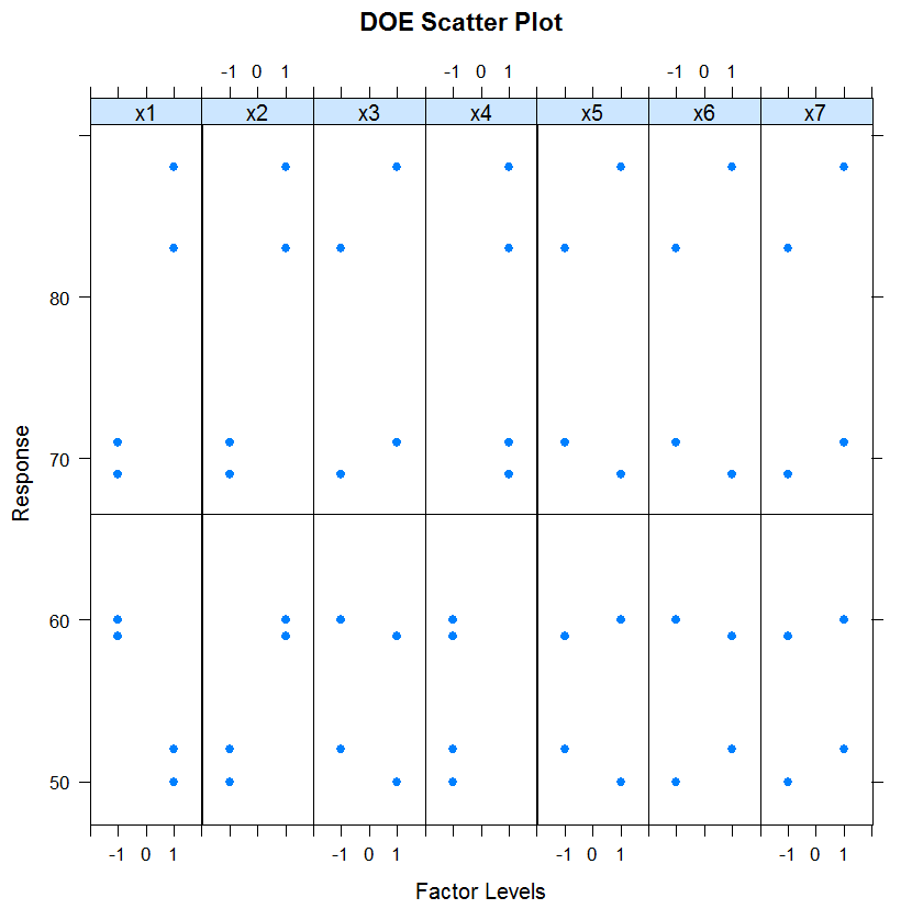
Although the plot can be drawn with an arbitrary number of levels for a factor, it is really only useful when there are two or three levels for a factor.
- there does not appear to be any outliers;
- the levels of factors 2 and 4 show distinct location differences; and
- the levels of factor 1 show distinct scale differences.
Response Values Versus Factor Variables
- Vertical axis: Value of the response variable
- Horizontal axis: Factor variable (with each level of the factor coded with a slightly offset x coordinate)
- Which factors are important with respect to location and scale?
- Are there outliers?
Identify Important Factors with Respect to Location and Scale
DOE scatter plots were designed primarily for analyzing designed experiments. However, they are useful for any type of multi-factor data (i.e., a response variable with two or more factor variables having a small number of distinct levels) whether or not the data were generated from a designed experiment.
Specifically, if there are k factors, we create a matrix of plots with k rows and k columns. On the diagonal, the plot is simply a DOE scatter plot with a single factor. For the off-diagonal plots, we multiply the values of Xi and Xj. For the common 2-level designs (i.e., each factor has two levels) the values are typically coded as -1 and 1, so the multiplied values are also -1 and 1. We then generate a DOE scatter plot for this interaction variable. This plot is called a DOE interaction effects plot and an example is shown below.
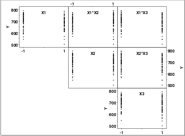
We can then examine the off-diagonal plots for the first order interaction effects. For example, the plot in the first row and second column is the interaction between factors X1 and X2. As with the main effect plots, no clear patterns are evident.
DOE standard deviation plot
Block plot
Box plot
Analysis of variance
