
5.6. Case Studies
5.6.3. Catapult Case Study
5.6.3.6. |
Best Settings |
- Graphical: DEX Contour Plot
- Quantititative: Sorted Data Table
- X4 (arm length) (effect = 40.3 inches)
- X3 (number of bands) (effect = 35.9 inches)
- X1 (band height) (effect = 27.0 inches)
- X5 (start point) (effect = 24.0 inches)
- X2 (stop angle) (effect = -22.2 inches)
- X3*X4 interaction (effect = 15.2 inches)
- X1*X4 interaction (effect = 9.4 inches)
- X1*X3 interaction (effect = 9.3 inches)
- X4 (arm length): horizontally
- X3 (number of bands): vertically
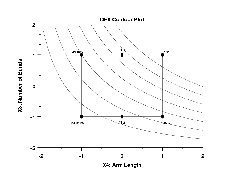
- Curvature and Interactions: The curvature in the contour
lines indicates a strong interaction effect between X3
and X4. Referring back to the Yates table ranking, we note
that the X3*X4 interaction was in fact the largest of all
of the intereactions (with a magnitude of 15.2), and so
the above graphical curvilinearity is consistent with
prior quantitative results. Note conversely that if the
contour curves had been linear, then that would imply a
planar model in X3 and X4 with the additional implication
that the X3*x4 cross-product effect is near zero.
- Cross-Validation: This is the statistical procedure whereby
a part (most) of the data is used for estimation and
inference, and a second (smaller) part of the data is set
aside and is used for validation and the confirmation.
Such was used here: contour curves were (by construction)
based on the 16 edge data points. The 4 pseudo-center
points were not used in the computation of
the contour curves. It is known (small residual standard
deviation) that the contour curves predict well on the
edges. Can we confidently use the model for prediction
everywhere else? Anywhere else? In particular, does it
predict well interior to the cube? To answer this, let us
compare the contour curves to the known data averages at
the two pseudo-center points (at X3 = -1 (41.25) and at
X3 = +1 (91.75)). If there is a good match, then that
gives us confidence in using the edge-based model for
interpolation; if not, then the use of the edge-based model
is severely restricted. In this case, we note (eyeball)
that at the X3 = -1 pseudo-center point, the average is
41.25 and the contour-lined based prediction is about 37
and so the error is approximately 4 inches. For the X3 = +1
pseudo-center point, the average is 91.75 but the
contour-lined based prediction is about 75 and so the
error in prediction is an overly-large 16 inches. Hence
in this case, the contour lines predict well in the
vicinity of the X3 = -1 pseudo-center point, but poorly at
the X3 = +1 pseudo-center point. This cross-validation
is discuraging and hence implies that the model may
not be used freely for interpolation, and hence
interpolatory best settings based on the model are not to
be trusted.
- Discrete Factor: Note that the factor X3 (number of bands) is intrinsically discrete (the number of bands is either 1 or 2 and one could not have, e.g., 1.7 bands). Given this, then one may have argue that the contour plots are meaningless. In a very real sense that is correct; on the other hand, the above two conclusions are both correct and the contour plots, discreteness notwithstanding, helped arrive at these two conclusions. In preparation for the upcoming question as to what are the best settings for (X1,X2,X3,X4,X5) for Y = 30, 60, and 90, we make use of the discreteness and relatively high importance of X3 (the second most important factor) to split the data (based on X3= -1 and X3 = +1) and generate the following two contour plots of X1 (the third most important factor) versus X4 (the most important factor)
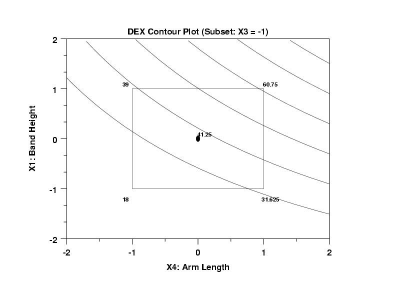
- The curves are relatively linear (implying a relatively small X1*X4 interaction).
- The response curves are relatively small (from 30 to 60).
- The curves fit the center point relatively well
(actual = 41.25; predicted = 37).
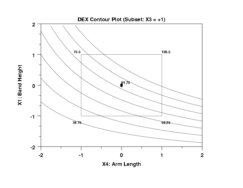
- The curves are curvilinear which implies a large X1*X4 interaction.
- The response curves are relatively large (from 40 to 90).
- The curves fit the center point poorly (actual = 91.75;
predicted = 73).
- Best Settings for Y = 30:
Choose the level of the splitting factor first; in this
case, since X3 = -1 is more centered on lower values of Y
than X3 = +1, and since X3 = -1 has better interpolatory
properties than X3 = +1, then choose X3 = -1. Given that,
any point along the Y = 30 curve will work. We choose the
intersection point of the Y = 30 curve and the bottom of
the box (X1 = -1). This yields X4 = +.8 and X1 = -1. This
is also near a vertex point with average 31.625. We have
3 out of the 5 settings:
-
(X1 = -1, X2 = ?, X3 = -1, X4 = +0.8, X5 = ?)
The remaining two settings (for X2 and X5) will be derived later.
- Best Settings for Y = 60:
Since X3 = -1 has better interpolatory properties than
X3 = +1, then choose X3 = -1. As before, any point along'
the Y = 60 curve will work. Note that Y = 60 comes
very close to the (X4 = +1, X1 = +1) vertex which has an
(average) value of 60.75--very close to 60. Unfortunately,
the two raw data values going into the 60.75 are quite
disparate: 36.5 (from ++-+-) and 85.0 (from +--++). We thus
see that the settings for X2 and X5 make a huge difference
in the response: (X2 = +1, X5 = -1) yields 36.5 while
(X2 = -1, X5 = +1) yields 85.0. We will decide on these
two value later, but for now, as before, we have
-
(X1 = -1, X2 = ?, X3 = -1, X4 = +0.8, X5 = ?)
- Best Settings for Y = 90:
Since the X3 = -1 contour plot has no values in the vicinity
of Y = 90 except for distant extrapolation, we resort
to the X3 = +1 plot. On this plot, we could make use of
the Y = 90 curve, but since the X3 = +1 case has such poor
interpolatory properties, it makes better sense to set
aside the biased curves and rely more heavily on the
observed data. Note, for example, that the center point
for the X3 = +1 contour plot has an average value of
91.75--very close to 90. Note that the data which led to
this center point average of 91.75 is from (00100)
replicates: 99.0 and 84.5. These 2 data points, even while
being collected under identical conditions, still differed
by almost 15 inches (with a standard deviation of 10.25
inches). This is large, but it is as good as the data
can do. That is, we have two values under replicate
conditions symmetrically spanning the desired Y = 90.
In conclusion, we choose our best settings for Y = 90 to be
-
(X1 = 0, X2 = 0, X3 = +1, X4 = 0, X5 = 0)
This is primarily a data-based estimate for the best settings, but given that the model performs poorly and yields biased estimates for this X3 = +1 case, such a data-based estimate is the preferred choice.
The sorted data (carrying along the settings of X1 to X5 is as follows:
                             RUN  CENT
   Y      X1  X2  X3  X4  X5 SEQ POINT
---------------------------------------
  8.00    -1   1  -1  -1  -1  10     0
 28.00    -1  -1  -1  -1   1   1     0
 28.25     1   1  -1  -1   1   8     0
 28.50     1   1   1  -1  -1  14     0

 33.00    -1  -1  -1   1  -1  12     0
 33.50    -1  -1   1  -1  -1  15     0
 35.00     1  -1  -1  -1  -1   6     0
 36.00    -1   1   1  -1   1  16     0
 36.50     1   1  -1   1  -1  11     0
 37.50     0   0  -1   0   0  19     2
 45.00    -1   1  -1   1   1  18     0
 45.00     0   0  -1   0   0   7     2
 45.00    -1   1   1   1  -1   5     0

 84.00     1  -1   1  -1   1  17     0
 84.50     0   0   1   0   0  13     1
 85.00     1  -1  -1   1   1   9     0

 99.00     0   0   1   0   0   2     1
106.00    -1  -1   1   1   1  20     0
126.50     1  -1   1   1  -1   4     0
126.50     1   1   1   1   1   3     0
- Bimodlality of the Data: Note that the data naturally splits
itself into two regions: 45 and below (13 values), and 84
and above (7 values).
- Important Factors:
- X3: Of the 13 low values, 9 have X3 = -1.
Of the 7 highest values, 6 have X3 = +1
This kind of strong reversal implies X3 is
the most important of the factors.
- X4: Of the 13 lowest values, 7 have X4 = -1.
Of the 7 highest values, only 1 has X4 = +1.
The 4 lowest values have X4 = -1.
The 3 highest values have X4 = +1.
X4 is also important (but next so).
- X1: Of the 13 lowest values, 7 have X1 = -1.
Of the 7 highest values, only 1 has X1 = +1.
The 2 lowest values have X1 = -1.
The 2 highest values have X1 = +1.
X1 is next in importance.
- X5: Of the 13 lowest values, 7 have X5 = -1.
Of the 7 highest values, only 1 has X5 = +1.
X5 is next in importance.
- X2: The distribution of -1's and +1's is fairly even. X2 is the least important of the 5 factors.
- X3: Of the 13 low values, 9 have X3 = -1.
Of the 7 highest values, 6 have X3 = +1
This kind of strong reversal implies X3 is
the most important of the factors.
- Best Settings for Y = 30:
Based only on the above sorted data, and considering the
large replication standard deviation of the data, a good
choice for Y = 30 would be the closest data point, namely,
28.5 which comes via
-
(X1 = +1, X2 = +1, X3 = +1, X4 = -1, X5 = -1)
Although this point has the smallest error (28.5 - 30 = -1.5 inches), any of the close points may also be used:
-
28.5 + + + - -
28.25 + + - - +
28.0 - - - - +
33.0 - - - + -
33.5 - - + - -
- Best Settings for Y = 60:
Based only on the above ordered data, no
setting yields a response anywhere in the
vicinity of Y = 60 and so no data-based
best setting is possible. In fact, there is no
empirical proof that ANY (possible) settings
of the catapult system will yield Y = 60.
We generate Y = 60 predicted values based on
the fact that we are assuming the model to
be of correct form and to be valid over the entire
region. The first assumption is
questionable and the second is false due to
poor interpolatory prediction (especially
for X3 = +1).
- Best Settings for Y = 90:
Based only on the above sorted data, and
considering the large replication standard
deviation of the data, a good choice for Y =
90 would be the closest data point, namely,
85 which comes via
-
(X1 = +1, X2 = -1, X3 = -1, x5 = +1, x6 = +1).
Although this point has the smallest error: 85 - 90 = -5 any of the close points may also be used:
-
85.0 + - - + +
84.5 0 0 + 0 0
84.0 + - + - +
- Best Settings for Y = 30:
If simplicity is preferred, use the "Sorted
Data" solution (+ + + - -) which yielded a
close to 30 data value (28.5). This solution
has the advantage that it is model-free.
A better solution (but it involves collecting more data) is to use the "DEX Contour Plot" solution of (- ? - + ?). The values of X2 and X5 are unknown. There are 4 cases for X2 and X5:
-
- - - + - data = 33.0
- + - + + data = 45.0
- + - + - no data
- - - + + no data
- Best Settings for Y = 60:
Since there is no data anywhere close to Y =
60, there is no "Sorted Data" recommendation.
The recommended solution involves collecting more data. data) is to use the "DEX Contour Plot" solution of (+ ? - + ?). The values of X2 and X5 are unknown. There are 4 cases for X2 and X5:
-
+ + - + - data = 36.5
+ - - + + data = 85.0
+ - - + - no data
+ + - + + no data
Make 2 additional runs to collect data at +--+- and ++-++ and then draw the X5 versus X2 DEX contour plot and use any value of X2 and X5 along the Y = 60 contour curve. Further, for this noisy region it would be preferable to collect a center point at +0-+0, and even better still to replicate that center point to determine a local estimate of noise.
- Best Settings for Y = 90:
If simplicity is preferred, use the "Sorted Data"
solution (0 0 + 0 0) which yielded an average close to
the desired 90 value (91.5). This solution has the
advantage that it is model-free.
Since the 2 data values (84.5 and 99) that went into that replicate average are quite disparate, then sampling anywhere else in the vicinity will probably be for naught. Hence in this case, the simplest solution (at the replicated center point for X3 = +1) is also the recommended best solution.
