
5.6. Case Studies
5.6.2. Sonoluminescent Light Intensity Case Study
5.6.2.2. |
Initial Plots/Main Effects |
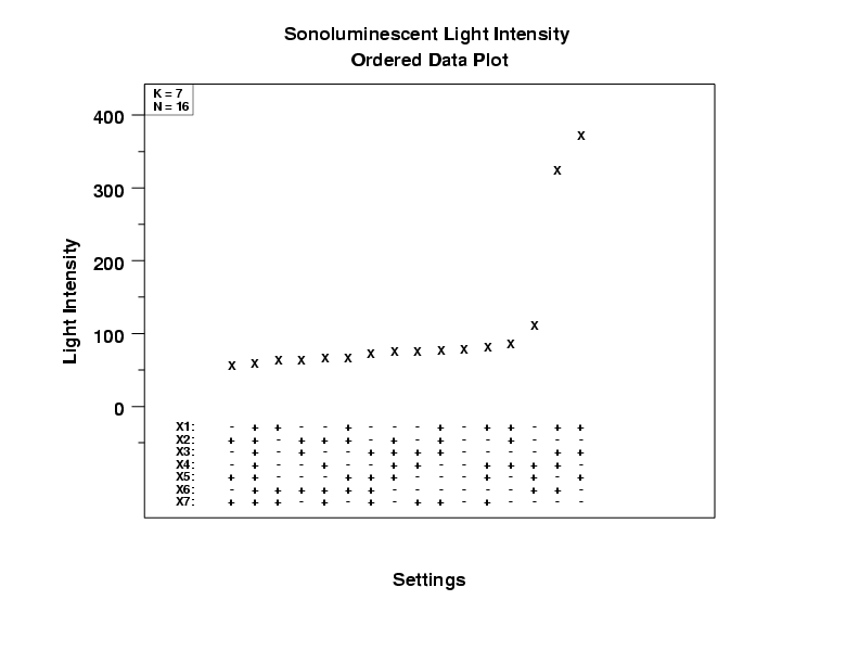
- Two points clearly stand out. The first 13 points lie in the
50 to 100 range, the next point is greater than 100, and the
last two points are greater than 300.
- Important Factors: For these two highest points, factors
X1, X2, X3, and X7 have the same
value (namely, +, -, +, -, respectively) while X4,
X5, and X6 have differing values. We
conclude that X1, X2, X3, and X7
are potentially important factors, while X4, X5,
and X6 are not.
- Best Settings: Our first pass makes use of the settings at the observed maximum (Y = 373.8). The settings for this maximum are (+, -, +, -, +, -, -).
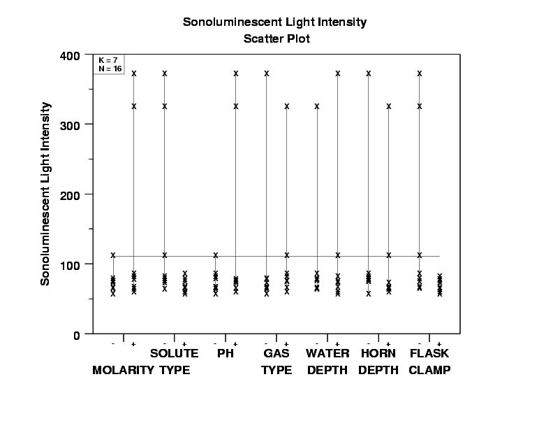
- Important Factors: Again, two points dominate the plot.
For X1, X2, X3, and X7, these two
points emanate from the same setting, (+, -, +, -), while for
X4, X5, and X6 they emanate from different
settings. We conclude that X1, X2, X3,
and X7 are potentially important, while X4,
X5, and X6 are probably not important.
- Best Settings: Our first pass at best settings yields (X1 = +, X2 = -, X3 = +, X4 = either, X5 = either, X6 = either, X7 = -).
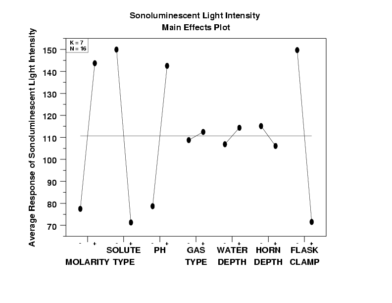
- Important Factors:
X2 (effect = large: about -80)
X7 (effect = large: about -80)
X1 (effect = large: about 70)
X3 (effect = large: about 65)
X6 (effect = small: about -10)
X5 (effect = small: between 5 and 10)
X4 (effect = small: less than 5)
- Best Settings: Here we step through each factor, one by one,
and choose the setting that yields the highest average
for the sonoluminescent light intensity:
-
(X1,X2,X3,X4,X5,X6,X7)
= (+,-,+,+,+,-,-)
In this case, the ordered data plot and the DOE scatter plot clearly show two dominant points. This feature would not be obvious if we had generated only the DOE mean plot.
Interpretation-wise, the most important factor X2 (solute) will, on the average, change the light intensity by about 80 units regardless of the settings of the other factors. The other factors are interpreted similarly.
In terms of the best settings, note that the ordered data plot, based on the maximum response value, yielded
-
+, -, +, -, +, -, -
-
+, -, +, ., +, -, -
