
1.3. EDA Techniques
1.3.3. Graphical Techniques: Alphabetic
1.3.3.21. |
Normal Probability Plot |
Check If Data Are Approximately Normally Distributed
The data are plotted against a theoretical normal distribution in such a way that the points should form an approximate straight line. Departures from this straight line indicate departures from normality.
The normal probability plot is a special case of the probability plot. We cover the normal probability plot separately due to its importance in many applications.
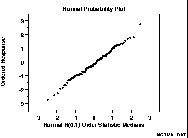
The points on this normal probablity plot of 100 normal random numbers form a nearly linear pattern, which indicates that the normal distribution is a good model for this data set.
Ordered Response Values Versus Normal Order Statistic Medians
- Vertical axis: Ordered response values
- Horizontal axis: Normal order statistic medians
The observations are plotted as a function of the corresponding normal order statistic medians which are defined as:
-
Ni = G(Ui)
The uniform order statistic medians (see Filliben 1975) can be approximated by:
-
Ui = 1 - Un
for i = 1
Ui = (i - 0.3175)/(n + 0.365) for i = 2, 3, ..., n-1
Ui = 0.5(1/n) for i = n
In addition, a straight line can be fit to the points and added as a reference line. The further the points vary from this line, the greater the indication of departures from normality.
Probability plots for distributions other than the normal are computed in exactly the same way. The normal percent point function (the G) is simply replaced by the percent point function of the desired distribution. That is, a probability plot can easily be generated for any distribution for which you have the percent point function.
One advantage of this method of computing probability plots is that the intercept and slope estimates of the fitted line are in fact estimates for the location and scale parameters of the distribution. Although this is not too important for the normal distribution since the location and scale are estimated by the mean and standard deviation, respectively, it can be useful for many other distributions.
The correlation coefficient of the points on the normal probability plot can be compared to a table of critical values to provide a formal test of the hypothesis that the data come from a normal distribution.
- Are the data normally distributed?
- What is the nature of the departure from normality (data skewed, shorter than expected tails, longer than expected tails)?
Check Normality Assumption
- random drawings;
- from a fixed distribution;
- with fixed location;
- with fixed scale.
-
response = deterministic + random
Probability plots for other distributions (e.g., Weibull)
Probability plot correlation coefficient plot (PPCC plot) Anderson-Darling Goodness-of-Fit Test
Chi-Square Goodness-of-Fit Test
Kolmogorov-Smirnov Goodness-of-Fit Test
