
5.5. Advanced topics
5.5.9. An EDA approach to experimental design
5.5.9.7. |
|Effects| plot |
-
What are the important factors (including interactions)?
The |effects| plot provides a graphical representation of these ordered estimates, Pareto-style from largest to smallest.
The |effects| plot, as presented here, yields both of the above: the plot itself, and the ranked list table. Further, the plot also presents auxiliary confounding information, which is necessary in forming valid conclusions for fractional factorial designs.
- Primary: A ranked list of important effects (and interactions).
For full factorial designs, interactions include the full
complement of interactions at all orders; for fractional
factorial designs, interactions include only some, and
occasionally none, of the actual interactions.
- Secondary: Grouping of factors (and interactions) into two categories: important and unimportant.
- Vertical Axis: Ordered (largest to smallest) absolute value
of the estimated effects for the main factors and for (available)
interactions. For n data points (no replication),
typically (n-1) effects will be estimated and the
(n-1) |effects| will be plotted.
- Horizontal Axis : Factor/interaction identification:
-
1 indicates factor X1;
2 indicates factor X2;
...
12 indicates the 2-factor X1*X2 interaction
123 indicates the 3-factor X1*X2*X3 interaction,
etc.
- Far right margin : Factor/interaction identification (built-in
redundancy):
-
1 indicates factor X1;
2 indicates factor X2;
...
12 indicates the 2-factor X1*X2 interaction
123 indicates the 3-factor X1*X2*X3 interaction,
etc. - Upper right table: Ranked (largest to smallest by magnitude)
list of the least squares estimates for the main effects and for
(available) interactions.
As before, if the design is a fractional factorial, the confounding structure is provided for main factors and 2-factor interactions.
For both the 2k full factorial designs and 2k-p fractional factorial designs, the form for the least squares estimate of the factor i effect, the 2-factor interaction effect, and the multi-factor interaction effect has the following simple form:
-
factor i effect =
\( \bar{Y} \)(+) - \( \bar{Y} \)(-)
2-factor interaction effect = \( \bar{Y} \)(+) - \( \bar{Y} \)(-)
multi-factor interaction effect = \( \bar{Y} \)(+) - \( \bar{Y} \)(-)
The essence of the above simplification is that the 2-level full and fractional factorial designs are all orthogonal in nature, and so all off-diagonal terms in the least squares X'X matrix vanish.
Moreover, since the sign of each estimate is completely arbitrary and will reverse depending on how the initial assignments were made (e.g., we could assign "-" to treatment A and "+" to treatment B or just as easily assign "+" to treatment A and "-" to treatment B), forming a ranking based on magnitudes (as opposed to signed effects) is preferred.
Given that, the ultimate and definitive ranking of factor and interaction effects will be made based on the ranked (magnitude) list of such least squares estimates. Such rankings are given graphically, Pareto-style, within the plot; the rankings are given quantitatively by the tableau in the upper right region of the plot. For the case when we have fractional (versus full) factorial designs, the upper right tableau also gives the confounding structure for whatever design was used.
If a factor is important, the "+" average will be considerably different from the "-" average, and so the absolute value of the difference will be large. Conversely, unimportant factors have small differences in the averages, and so the absolute value will be small.
We choose to form a Pareto chart of such |effects|. In the Pareto chart, the largest effects (most important factors) will be presented first (to the left) and then progress down to the smallest effects (least important) factors to the right.
- The ranked list of factors (including interactions)
is given by the left-to-right order of the spikes.
These spikes should be of decreasing height as we move
from left to right. Note the factor identifier associated
with each of these bars.
- Identify the important factors. Forming the ranked list of
factors is important, but is only half of the analysis.
The second part of the analysis is to take the ranking and
"draw the (horizontal) line" in the list and on the graph so
that factors above the line are deemed "important while factors
below the line are deemed unimportant.
Since factor effects are frequently a continuum ranging from the very large through the moderate and down to the very small, the separation of all such factors into two groups (important and unimportant) may seem arbitrary and severe. However, in practice, from both a research funding and a modeling point of view, such a bifurcation is both common and necessary.
From an engineering research-funding point of view, one must frequently focus on a subset of factors for future research, attention, and money, and thereby necessarily set aside other factors from any further consideration. From a model-building point of view, a final model either has a term in it or it does not--there is no middle ground. Parsimonious models require in-or-out decisions. It goes without saying that as soon as we have identified the important factors, these are the factors that will comprise our (parsimonious) good model, and those that are declared as unimportant will not be in the model.
Given that, where does such a bifurcation line go?
There are four ways, each discussed in turn, to draw such a line:
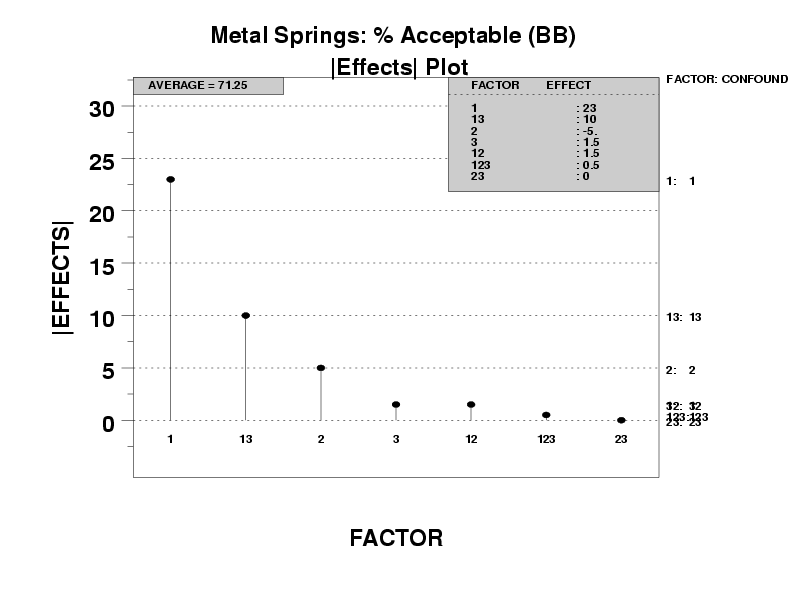
- Ranked list of factors (including interactions):
- X1 (most important)
- X1*X3 (next most important)
- X2
- other factors are of lesser importance
- Separation of factors into important/unimportant categories:
- Important: X1, X1*X3, and X2
- Unimportant: the remainder
