Next Page Previous Page Home Tools & Aids Search Handbook
1. Exploratory Data Analysis
1.3. EDA Techniques
1.3.3. Graphical Techniques: Alphabetic
1.3.3.21. Normal Probability Plot

1.3.3.21.1.

Normal Probability Plot: Normally Distributed Data

Normal Probability Plot The following normal probability plot is from the heat flow meter data.

normal probability plot of heat flow meter data

Conclusions We can make the following conclusions from the above plot.
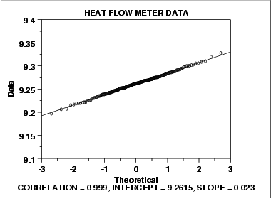
  1. The normal probability plot shows a strongly linear pattern. There are only minor deviations from the line fit to the points on the probability plot.
  2. The normal distribution appears to be a good model for these data.
Discussion Visually, the probability plot shows a strongly linear pattern. This is verified by the correlation coefficient of 0.9989 of the line fit to the probability plot. The fact that the points in the lower and upper extremes of the plot do not deviate significantly from the straight-line pattern indicates that there are not any significant outliers (relative to a normal distribution).

In this case, we can quite reasonably conclude that the normal distribution provides an excellent model for the data. The intercept and slope of the fitted line give estimates of 9.26 and 0.023 for the location and scale parameters of the fitted normal distribution.

Home Tools & Aids Search Handbook Previous Page Next Page