8.2. Assumptions/Prerequisites
8.2.2. How do you plot reliability data?
8.2.2.3. |
Trend and growth plotting (Duane plots) |
Before constructing a Duane Plot, there are a few simple trend plots that often convey strong evidence of the presence or absence of a trend in the repair rate over time. If there is no trend, an HPP model is reasonable. If there is an apparent improvement or degradation trend, a Duane Plot will provide a visual check for whether the NHPP Power law model is consistent with the data.
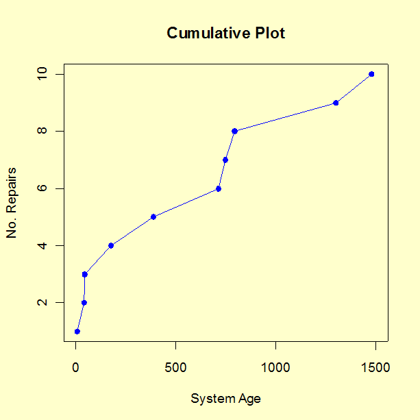
- Plot cumulative failures versus system age (a step function that goes up every time there is a new failure). If this plot looks linear, there is no obvious improvement (or degradation) trend. A bending downward indicates improvement; bending upward indicates degradation.
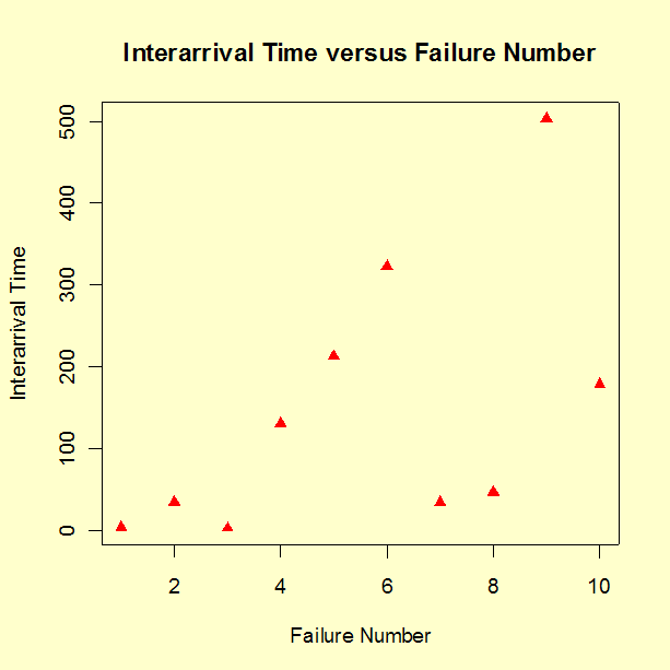
- Plot the inter arrival times between new failures (in other words, the waiting times between failures, with the time to the first failure used as the first "inter-arrival" time). If these trend up, there is improvement; if they trend down, there is degradation.
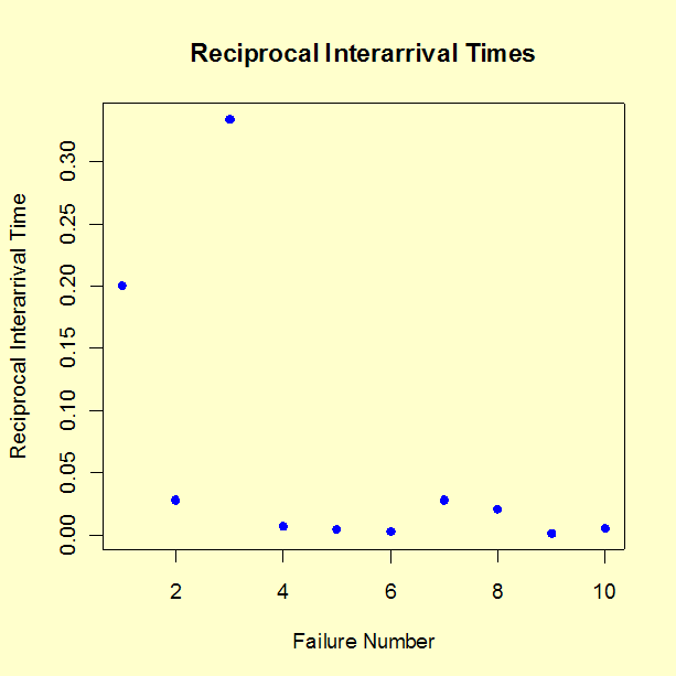
- Plot the reciprocals of the inter-arrival times. Each reciprocal is a new failure rate estimate based only on the waiting time since the last failure. If these trend down, there is improvement; an upward trend indicates degradation.
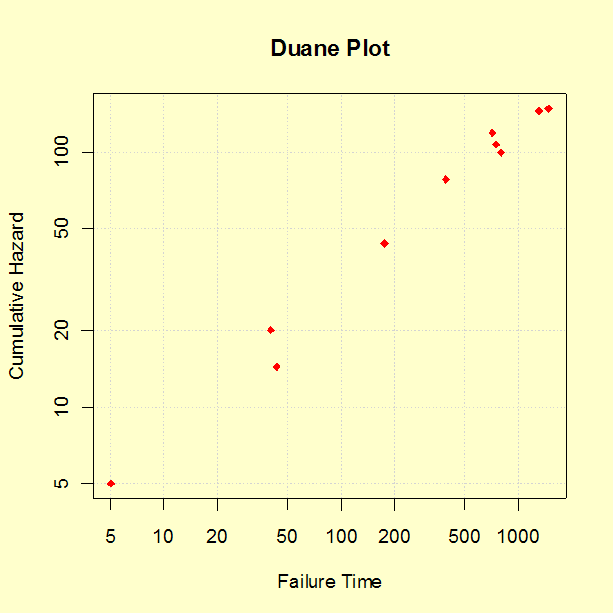
A prototype of a new, complex piece of equipment went through a 1500 operational hours Reliability Improvement Test. During the test there were 10 failures. As part of the improvement process, a cross functional Failure Review Board made sure every failure was analyzed down to the root cause and design and parts selection fixes were implemented on the prototype. The observed failure times were: 5, 40, 43, 175, 389, 712, 747, 795, 1299 and 1478 hours, with the test ending at 1500 hours. The reliability engineer on the Failure Review Board first made trend plots as described above, then made a Duane plot. These plots follow.


| Time | Cum MTBF |
| 5 | 5 |
| 40 | 20 |
| 43 | 14.3 |
| 175 | 43.75 |
| 389 | 77.8 |
| 712 | 118.67 |
| 747 | 106.7 |
| 795 | 99.4 |
| 1299 | 144.3 |
| 1478 | 147.8 |

Comments: The three trend plots all show an improvement trend. The reason it might be useful to try all three trend plots is that a trend might show up more clearly on one plot than the others. Formal statistical tests on the significance of this visual evidence of a trend will be shown in the section on Trend Tests.
The points on the Duane Plot line up roughly as a straight line, indicating the NHPP Power Law model is consistent with the data.
Estimates for the reliability growth slope and the MTBF at the end of this test for this case study will be given in a later section.

