|
|
STATISTIC PLOTName:
The statistic plot yields 2 traces:
The appearance of these two traces is controlled by the first two settings of the LINES, CHARACTERS, SPIKES, BARS, and associated attribute setting commands.
<SUBSET/EXCEPT/FOR qualification> where <stat> is one of Dataplot's supported statistics; <y1> ... <yk> is a list of 1 to 3 response variables (<stat> determines how many response variables); <x> is the subsample identifier variable (this variable appears on the horizontal axis); and where the <SUBSET/EXCEPT/FOR qualification> is optional. For a list of supported statistics, enter
<SUBSET/EXCEPT/FOR qualification> where <stat> is one of Dataplot's supported statistics; <y1> ... <yk> is a list of 1 to 30 response variables; <x> is the subsample identifier variable (this variable appears on the horizontal axis); and where the <SUBSET/EXCEPT/FOR qualification> is optional. This syntax is used for multiple response variables. See the Note section below for details on this syntax. For a list of supported statistics, enter
<SUBSET/EXCEPT/FOR qualification> where <stat> is one of Dataplot's supported statistics; <y1> ... <yk> is a list of 1 to 3 response variables (<stat> determines how many response variables); <x> is the subsample identifier variable (this variable appears on the horizontal axis); <tag> is the group identifier variable (this variable defines plot traces for the groups); and where the <SUBSET/EXCEPT/FOR qualification> is optional. For this syntax, there are two group variables. The <x> variable is used as in syntax 1. That is, this variable is used to define the sub-groups for computing the statistic. In syntax 1, there are two plot traces created. The first contains the statistic value for each group and the second contains the statistic for the full data set. With this syntax, the <tag> variable is used to define groups with the same plot attributes. For example, if <tag> contains three distinct values (1, 2, and 3), there will be four plot traces created. The first trace is for groups (<x> where the corresponding <tag> value is 1, the second trace is where the corresponding <tag> value is 2, the third trace is where the corresponding <tag> value is 3, and the fourth trace is the statistic for the full data set. The <tag> value should be the same for all rows in a group defined by <x>. However, if this is not the case, the <tag> value corresponding to the first row in <x> for that group will be used. This syntax is used to highlight certain groups. For example, groups that denote potential outliers might be highlighted in a different color. This syntax is demonstrated in the Program 3 example.
STANDARD DEVIATION PLOT Y X1 MEAN PLOT Y1 TO Y5 X MEAN TAG PLOT Y X TAG
LET NGROUP = SIZE TAGDIST
LET IGROUP TAGDIST(K) LET A = RANK CORRELATION Y1 Y2 SUBSET TAG = IGROUP LET YNEW(K) = A LET XNEW(K) = K END OF LOOP LET YNEW2 = DATA A A LET XNEW2 = DATA 1 NGROUP PLOT YNEW XNEW AND PLOT YNEW2 XNEW2 This basic idea can be easily adapted to other statistics (even ones that are not built-in to DATAPLOT). It can also be adapted to statistics requiring any arbitrary number of variables to compute. The 2016/08 version of Dataplot added the STATISTIC BLOCK command that can be used to define a statistic.
That is, for each distinct value of X, there are now 4 means plotted instead of just one. The following commands can be used to control the appearance of the plot:
SET STATISTIC PLOT SUMMARY <VARIABLE/GROUP> If the FORMAT option is set to OVERLAY and the SUMMARY option is set to VARIABLE, this is equivalent to the following:
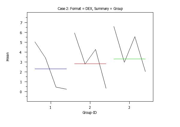
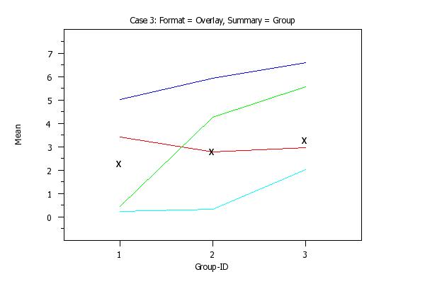
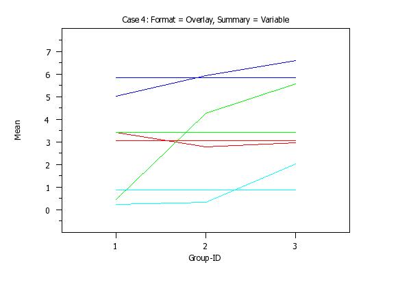
PRE-ERASE OFF ERASE MEAN PLOT Y1 X MEAN PLOT Y2 X MEAN PLOT Y3 X MEAN PLOT Y4 X PRE-ERASE ON That is, there will be a curve corresponding to each response variable and there will be a reference line corresponding to each variable. If the FORMAT option is set to DEX, then this plot uses a format similar to the DEX <stat> PLOT command. That is, for each distinct value of X, there will be curve connecting the mean values for the 4 response variables. If the SUMMARY option is set to GROUP, there will be a single reference curve. At each distinct value of X, a single overall mean is computed for all 4 of the response variables. In addition, the following option is added to this command:
If ZSCORE is given, then a z-score transformation (subtract the mean and then divide by the standard deviation) is computed on each response variable first. If USCORE is given, then a u-score transformation (subtract the minimum and divide by the range) is computed on each column. Note these z-score and u-score transformations apply to the entire response variable, not to each distinct group within the response variable.
For some statistics (e.g., STANDARD DEVIATION and other scale statistics), this may not be particularly meaningful. Alternatively you can specify either the mean or the median value of the statistic over the groups. For example, if you are generating a standard deviation plot and you have 10 groups, you can specify that the reference line be drawn at the mean (or the median) of the 10 computed standard deviations. To specify what reference line is drawn, enter
where OVERALL is the value of the statistic for all of the data, AVERAGE is the mean of the statistic over the groups, and MEDIAN is the median of the statistic over the groups. The default is OVERALL.
2009/04: support for multiple response variables 2015/04: added SET STATISTIC PLOT REFERENCE LINE 2018/02: support for a tag variable (Syntax 3) The list of supported statistics has been regulary updated since the original 1988/2 implementation.
SKIP 25
READ GEAR.DAT DIAMETER BATCH
.
TITLE AUTOMATIC
TITLE OFFSET 2
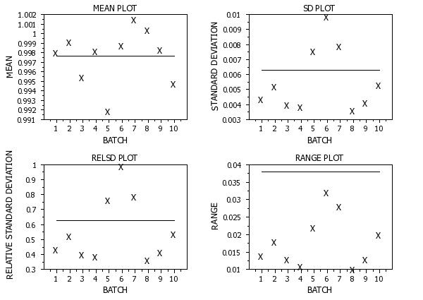
MULTIPLOT 2 2
MULTIPLOT CORNER COORDINATES 3 0 100 100
MULTIPLOT SCALE FACTOR 2
X1LABEL DISPLACEMENT 14
Y1LABEL DISPLACEMENT 12
TIC MARK LABEL SIZE 1.8
.
XTIC OFFSET 1 1
X1LABEL BATCH
LINE BLANK SOLID
CHARACTER X BLANK
Y1LABEL MEAN
TITLE MEAN PLOT
MEAN PLOT DIAMETER BATCH
Y1LABEL STANDARD DEVIATION
TITLE SD PLOT
STANDARD DEVIATION PLOT DIAMETER BATCH
Y1LABEL RELATIVE STANDARD DEVIATION
TITLE RELSD PLOT
RELSD PLOT DIAMETER BATCH
Y1LABEL RANGE
TITLE RANGE PLOT
RANGE PLOT DIAMETER BATCH
.
END OF MULTIPLOT
 Program 2:
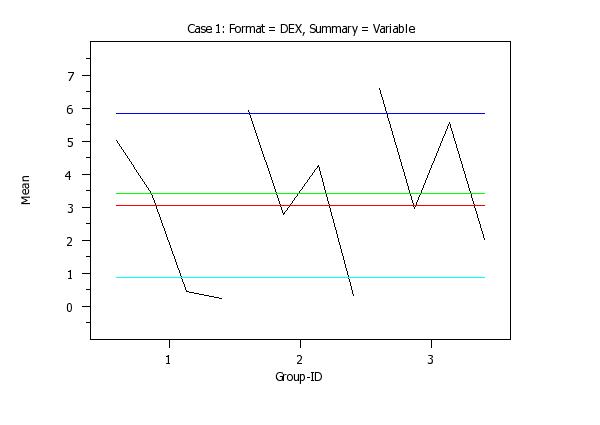
skip 25
read iris.dat y1 to y4 x
.
title case asis
title offset 2
label case asis
y1label Mean
x1label Group-ID
xlimits 1 3
major xtic mark number 3
minor xtic mark number 0
xtic offset 0.6 0.6
ytic offset 1 1
.
set stat plot format  dex
set stat plot summary vari
title sp()Case 1: Format = DEX, Summary = Variable
line color black black black blue red green cyan
mean plot y1 to y4 x
.
set stat plot format  dex
set stat plot summary group
title sp()Case 2: Format = DEX, Summary = Group
mean plot y1 to y4 x
.
set stat plot format overlay
set stat plot summary group
line color blue red green cyan
line so so so so bl
char bl bl bl bl x
title sp()Case 3: Format = Overlay, Summary = Group
mean plot y1 to y4 x
.
set stat plot format overlay
set stat plot summary variable
line so all
char bl all
line color blue red green cyan blue red green cyan
title sp()Case 4: Format = Overlay, Summary = Variable
mean plot y1 to y4 x
. Step 1: Read the data
.
skip 25
read gear.dat y x
skip 0
let tag = sequence 1 10 1 2 for i = 1 1 100
.
. Step 2: Define plot control settings
.
case asis
label case asis
title case asis
title offset 2
.
xlimits 1 10
major x1tic mark number 10
minor x1tic mark number 0
tic offset units data
x1tic mark offset 0.5 0.5
.
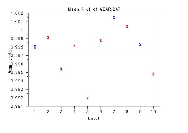
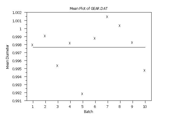
title Mean Plot of GEAR.DAT
y1label Mean Diameter
x1label Batch
.
. Step 3: Generate the plot without tags
.
character X blank
line blank solid
mean plot y x
.
. Step 4: Generate the plot with tags
.
character X X blank
character color blue red
line blank blank solid
.
mean tag plot y x tag
Date created: 09/22/2011 |
Last updated: 12/04/2023 Please email comments on this WWW page to alan.heckert@nist.gov. | ||||||||||||||||||||||
 Program 3: