6.4. Introduction to Time Series Analysis
6.4.4. Univariate Time Series Models
6.4.4.6. Box-Jenkins Model Identification
6.4.4.6.2. |
Model Identification for the CO2 Concentrations Data |
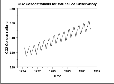
The initial run sequence plot of the data indicates a rising trend. A visual inspection of this plot indicates that a simple linear fit should be sufficient to remove this upward trend.
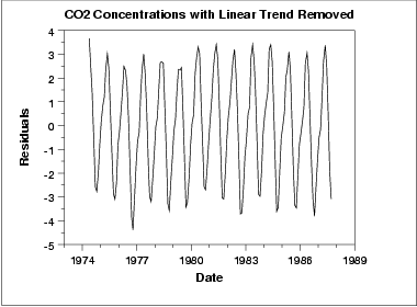
This plot contains the residuals from a linear fit to the original data. After removing the linear trend, the run sequence plot indicates that the data have a constant location and variance, which implies stationarity.
However, the plot does show seasonality. We generate an autocorrelation plot to help determine the period followed by a seasonal subseries plot.
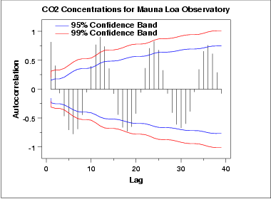
The autocorrelation plot shows an alternating pattern of positive and negative spikes. It also shows a repeating pattern every 12 lags, which indicates a seasonality effect.
The two connected lines on the autocorrelation plot are 95% and 99% confidence intervals for statistical significance of the autocorrelations.
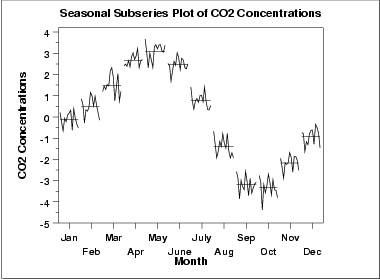
A significant seasonal pattern is obvious in this plot, so we need to include seasonal terms in fitting a Box-Jenkins model. Since this is monthly data, we would typically include either a lag 12 seasonal autoregressive and/or moving average term.
To help identify the non-seasonal components, we will take a seasonal difference of 12 and generate the autocorrelation plot on the seasonally differenced data.
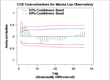
This autocorrelation plot shows a mixture of exponential decay and a damped sinusoidal pattern. This indicates that an AR model, with order greater than one, may be appropriate. We generate a partial autocorrelation plot to help identify the order.
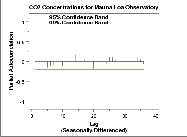
The partial autocorrelation plot suggests that an AR(2) model might be appropriate since the partial autocorrelation becomes zero after the second lag. The lag 12 is also significant, indicating some remaining seasonality.
In summary, our intial attempt would be to fit an AR(2) model with a seasonal AR(12) term on the data with a linear trend line removed. We could try the model both with and without seasonal differencing applied. Model validation should be performed before accepting this as a final model.

