
8.2. Assumptions/Prerequisites
8.2.2. How do you plot reliability data?
8.2.2.1. |
Probability plotting |
The \(x\) axis is labeled "Time" and the axis is labeled "cumulative percent" or "percentile". There are rules, independent of the model, for calculating plotting positions (points) from the reliability data. These only depend on the type of censoring in the data and whether exact times of failure are recorded or only readout times.
At the time \(t_i\) of the \(i\)-th failure, we need an estimate of the CDF (or the cumulative population percent failure). The simplest and most obvious estimate is just \(100(i/n)\) (with a total of \(n\) units on test). This, however, is generally an overestimate (i.e. biased). Various texts recommend corrections such as \(100(i-0.5)/n\) or \(100i/(n+1)\). Here, we recommend what are known as (approximate) median rank estimates.
For each time \(t_i\) of the \(i\)-th failure, calculate the CDF or percentile estimate using \(100(i-0.3)/(n+0.4)\).
Plotting Positions: Readout Data
Let the readout times be \(T_1, \, T_2, \, \ldots, \, T_k\) and let the corresponding new failures recorded at each readout be \(r_1, \, r_2, \, \ldots, \, r_k\). Again, there are \(n\) units on test.
For each readout time \(T_j\), calculate the CDF or percentile estimate using $$ \frac{100 \sum_{i=1}^j r_i}{n} \, . $$ Plotting Positions: Multicensored Data
The calculations are more complicated for multicensored data. K-M estimates (described in a preceding section) can be used to obtain plotting positions at every failure time. The more precise Modified K-M Estimates are recommended. They reduce to the Censored Type I or the Censored Type II median rank estimates when the data consist of only failures, without any removals except possibly at the end of the test.
a) Exponential Model: Rewrite the exponential CDF as $$ \mbox{ln} \left( \frac{1}{1-F(t)} \right) = \lambda t \, , $$ or, equivalently, $$ \mbox{log} \left( \frac{1}{1 - F(t)} \right) = \frac{\lambda}{\mbox{ln } 10} t \, . $$ If we let \(y = 1/[1-F(t)]\) and \(x = t\), then \(\mbox{log } y\) is linear in \(x\) with slope \(\lambda / \mbox{ln } 10\). Thus, we can make an exponential probability plot by using a logarithmic \(y\) axis. Use the plotting position estimates for \(F(t_i)\) described above (without the 100 × multiplier) to calculate pairs of \((x_i,\, y_i)\) points.
If the data are consistent with an exponential model, the resulting plot will have points that line up almost as a straight line going through the origin with slope \(\lambda / \mbox{ln } 10\).
b) Weibull Model: Rewrite the Weibull CDF as $$ \mbox{ln ln } \left( \frac{1}{1-F(t)} \right) = \gamma \mbox{ ln } t - \gamma \mbox{ ln } \alpha $$ or $$ \mbox{log ln } \left( \frac{1}{1-F(t)} \right) = \gamma \mbox{ log } t - \gamma \mbox{ log } \alpha \, . $$ If we let \(y = \mbox { ln }(1/[1-F(t)])\) and \(x = t\), then \(\mbox{log } y\) is linear in \(\mbox{log } x\) with slope \(\gamma\). Thus, we can make a Weibull probability plot using a log-log scale. Use the plotting position estimates for \(F(t_i)\) (without the 100 × multiplier) to calculate pairs of \((x_i, \, y_i)\) points.
If the data are consistent with a Weibull model, the resulting plot will have points that line up roughly on a straight line with slope \(\gamma\). This line will cross the \(\mbox{log } x\) axis at time \(t = \alpha\) and the \(\mbox{log } y\) axis (i.e., the intercept) at \(-\gamma \mbox{ log } \alpha\).
c) Lognormal Model: Rewrite the lognormal cdf as $$ \mbox{ln } t = \sigma \, \Phi^{-1} \left[ F(t) \right] + \mbox { ln } T_{50} $$ or, $$ \mbox{log } t = \frac{\sigma}{\mbox{ln } 10} \Phi^{-1} \left[ F(t) \right] + \mbox{ log } T_{50} \, , $$ with \(\Phi^{-1}\) denoting the inverse function for the standard normal distribution (taking a probability as an argument and returning the corresponding "\(z\)" value).
If we let \(y = t\) and \(x = \Phi^{-1}[F(t)]\) then \(\mbox{log } y\) is linear in \(x\) with slope \(\sigma / \mbox{ln } 10\) and intercept (when \(F(t)\) = 0.5) of \(\mbox{log } T_{50}\). We generate a lognormal probability plot using a logarithmic \(y\) axis. Use the plotting position estimates for \(F(t_i)\) (without the 100 × multiplier) to calculate pairs of (\(x_i, \, y_i\)) points.
If the data are consistent with a lognormal model, the resulting plot will have points that line up roughly on a straight line with slope \(\sigma / \mbox{ln } 10\) and intercept \(T_{50}\) on the \(\mbox{log } y\) axis.
d) Extreme Value Distribution (Type I - for minimum): Rewrite the extreme value distribution CDF as $$ \mbox{ln } \left\{ -\mbox{ ln } [1 - F(x)]\right\} = (x - \mu)/\beta \, . $$ If we let \(y = -\mbox{ ln }[1 - F(x)]\), then \(\mbox{ln } y\) is linear in \(x\) with slope 1/\(\beta\) and intercept \(-\mu / \beta\). We plot \(y\) versus \(x\) where the \(y\) axis is base 10 logarithmic. The points should follow a straight line with a slope of \((1/\beta) \cdot \mbox{ln } 10\) and an intercept of (\(-\mu/\beta) \cdot \mbox{ln } 10\). The \(\mbox{ln } 10\) factors in the slope and intercept are needed because the plot uses a base 10 logarithmic axis.
|
Failure (\(i\)) |
Time of Failure (\(x\)) |
\(F(t_i)\) estimate \((i-0.3)/(20+0.4)\) |
ln\((1/[1-F(t_i)])\) (\(y\)) |
|
|
|
|
|
|
|
|
|
|
|
|
|
|
|
|
|
|
|
|
|
|
|
|
|
|
|
|
|
|
|
|
|
|
|
|
|
|
|
|
|
|
|
|
|
|
|
|
|
|
We generate a probability plot using column (4) versus column (2) and log-log scale axes.
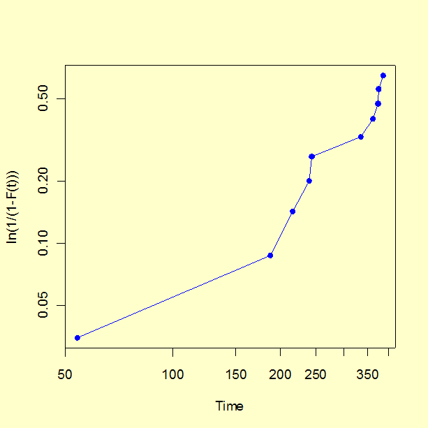 Note that the configuration of points appears to have some curvature.
This is mostly due to the very first point on the plot (the earliest time
of failure). The first few points on a probability plot have more variability
than points in the central range and less attention should be paid to them
when visually testing for "straightness".
Note that the configuration of points appears to have some curvature.
This is mostly due to the very first point on the plot (the earliest time
of failure). The first few points on a probability plot have more variability
than points in the central range and less attention should be paid to them
when visually testing for "straightness".
The regression produces a slope estimate of 1.46, which is close to the 1.5 value used in the simulation. The intercept is -4.114 and setting this equal to \(-\gamma \mbox{ log } \alpha\) we estimate \(\alpha\) = 657 (the "true" value used in the simulation was 500).
The analyses in this section can can be implemented using both Dataplot code and R code. Both packages have special functions to automatically generate probability plots for a wide variety of distributions.
